
Swashing Through de Velde
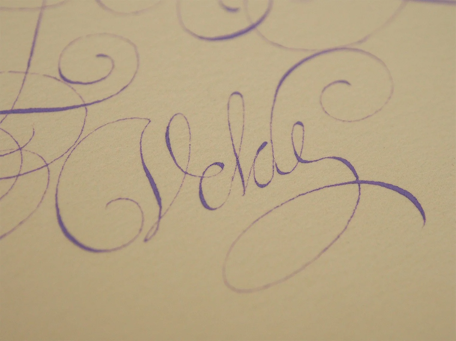
My copy of Van de Velde's signature from the base of a page of flourished capitals included in his copybook Spieghel der Schrijfkonste (Mirror of the Art of Writing), completed with purple gouache on warm white colored Arches text laid paper
Hello friends
Welcome to the February 2026 issue of Books with Hook. If it’s your first time here, this is a monthly study blog focused on historical calligraphic works, manuscripts, and related printed materials.
You can find past entries here: https://www.lindsey-hook.com/books-with-hook/
If you’d like to follow along for future posts, please join my mailing list.
All the Swashes! All the Loops!
If this is your first time encountering Jan van de Velde, you are in for a treat. He was one of the most prominent Dutch calligraphers and writing masters in the early 17th century. The Netherlands during this time period were at the forefront of fine writing and were known for incredible high quality engraving. Van de Velde’s work, along with his collaborator, the engraver Simon Frisius, exemplify this, and the copybook they produced together—Spieghel der Schrijfkonste (Mirror of the Art of Writing)—is a lovely example of the state of writing for the time. Published in 1605, the book contains sample writings and alphabets for a number of scripts. I decided to focus on Van de Velde’s Italian capitals.
The Rijksmuseum has wonderful high resolution images of much of the book, including some draft pages. I often have trouble navigating the museum’s site, but I believe this link should include a directory with links to all the images: https://www.rijksmuseum.nl/nl/collectie/object/Spieghel-der-schrijfkonste-inden-welcken-ghesien-worden-veelderhande-geschriften-met-hare-fondementen-ende-onderrichtinghe-uutghegeven--e973a5aaca4d1f9ec3bd3de0e9bb6eb3?tab=data
The Letterform Archive also has high resolution scans of a printing of the book that you can see on the internet archive: https://archive.org/details/lfawritingmanuals0074/lfa_writingmanuals_0074_001.jpg
If you’ve been following along with this study blog, you may remember that last month I looked at an Italian Hand alphabet, and spent a lot of time considering how the use of quills—particularly the angle at which they were held—impacted the lineweight of the lowercase letters. Italian Hand is characterized by delicate, narrow lowercase letters with minimal variation in lineweights, with the notable exception of the ascenders and descenders. You can see this in Van de Velde’s lowercase exemplar. The lineweights clearly show the use of a fine, but still slightly edged quill being held at a roughly 45° angle.
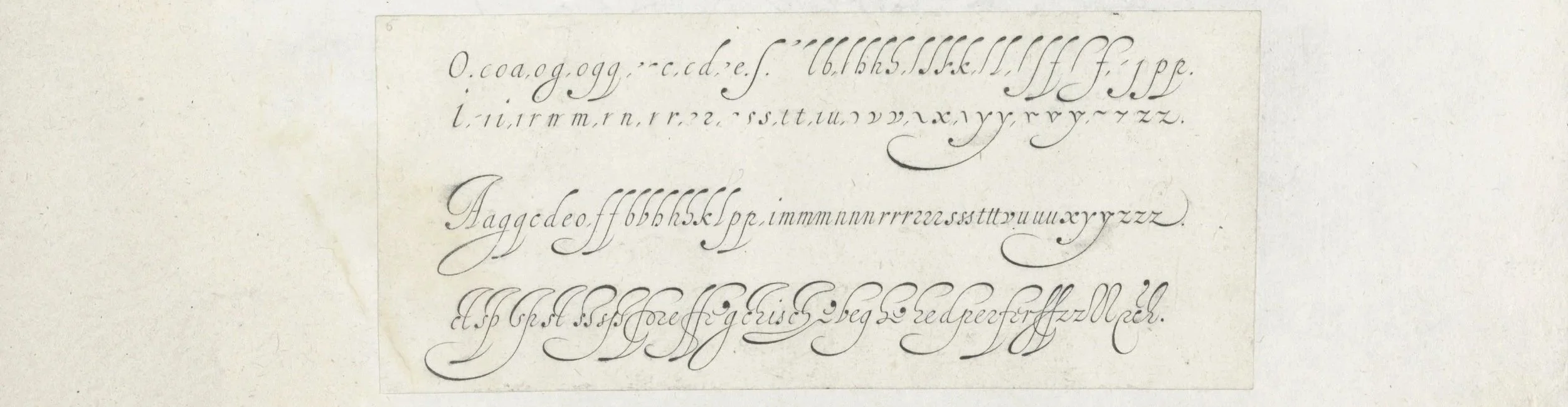
© Rijksmuseum - Van de Velde's exemplar for the lowercase Italian letterforms included in Spieghel der Schrijfkonste (Mirror of the Art of Writing), presumably engraved by Simon Frisius. You can see the full page here: https://www.rijksmuseum.nl/nl/collectie/object/Twee-ontwerpen-van-schrijfvoorbeelden-de-Italiaanse-letter--273ea95e6a6f01856495b51e75a6acfc?tab=data
Something different happens with the capitals though. You can see it in the swash off the peak of the capital A in the middle line above. It becomes unavoidable in his basic caps exemplar.
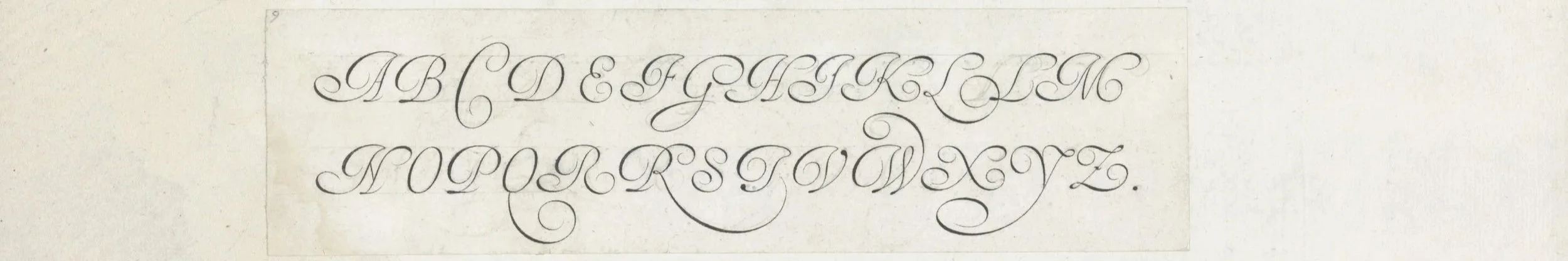
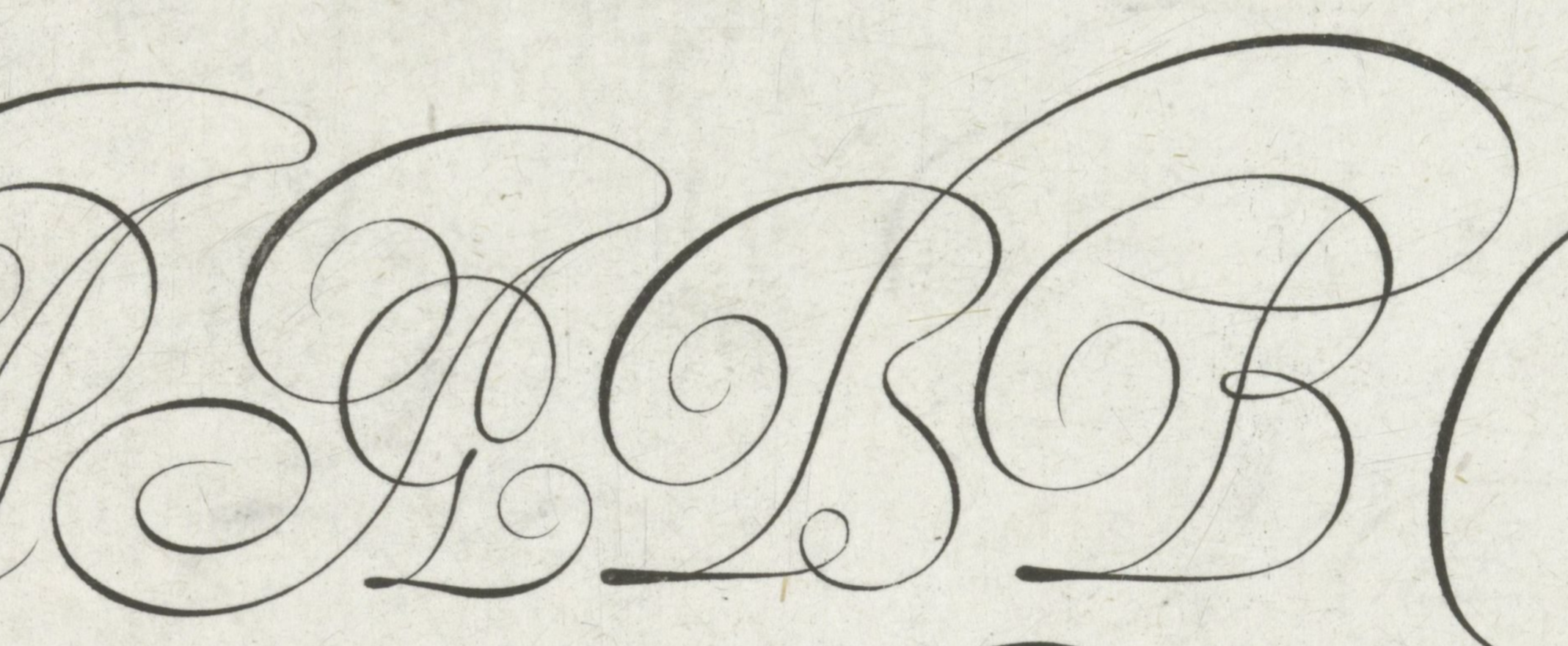
© Rijksmuseum - Van de Velde's exemplar for the capital Italian letterforms included in Spieghel der Schrijfkonste (Mirror of the Art of Writing), presumably engraved by Simon Frisius. You can see the full page here: https://www.rijksmuseum.nl/nl/collectie/object/Drie-ontwerpen-van-schrijfvoorbeelden-het-alfabet-in-kapitalen--ddee067bb2d8966917c0bc7b7dc5ded5?tab=data
Look at that A kicking everything off. The swash curling off the base of the left stem is shaded in keeping with the pen being held at roughly a 45° angle like expected based on the lowercase letters, but that top swash from the peak? It’s shaded in the opposite direction. It’s impossible to achieve a shaded stroke like that with the pen at 45°.
Moving on the B, the top swash coming off to the left matches that of the A, but then the curve through the bowls is back at 45° with the same stroke. This is consistent through all the caps
It’s interesting to note that the only place this happens is in the swashes that proceed out to the left from the top of the letterform, and the singular instance of the descender loop on the G. Coming from my perspective as someone familiar with English roundhand, and copperplate, and using an oblique pen holder, these swashes feel very natural. I also understand them from a design perspective. They balance the density of the letters. But I find myself wondering whether they were actually written like this in practice, or is this embellishment made easy due to the nature of engraving?
I haven’t seen enough actual manuscripts and everyday writing samples to really answer this question, but I suspect it’s a nuanced combination of both. It seems unlikely to me that it would’ve been done as part of everyday writing. However, the way the clubbed ascenders of lowercase letters from the period are retouched and filled leads me to believe that more skilled scribes, likely did include these swashes.
I find it very natural to rotate the pen in my hand to an off-hand position where I can expand the nib as I pull it away from me to fill the clubs of descenders. The swashes on the caps can be done the same way and with practice, this switching becomes part of the rhythm of the script. I sometimes struggle with doing the swashes with this offhand grip. I think too much muscle-memory of drawing the nib toward me for this kind of shape with the amount of copperplate I write.
Another option could be that scribes of the period swapped their grip to hold the shaft of the quill between their middle and ring fingers so that the edge of the nib rests on the page at roughly 135°. This lines the quill/pen up with the slant of the script and allows for the shaded stroke to be pulled toward the body. I’ve seen in later writing manuals that this style of grip was perhaps taught for English roundhand, so perhaps this is more likely than an offhand grip. Or maybe it was a combination of all three!
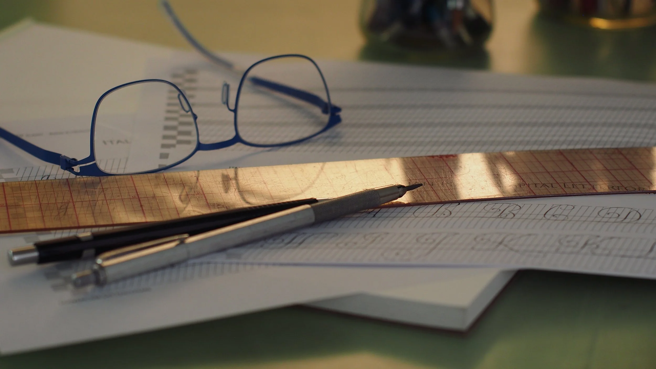
I thought it would be a fun exercise to try out a cap using a straight holder, an oblique, and a small edged nib in a straight holder.
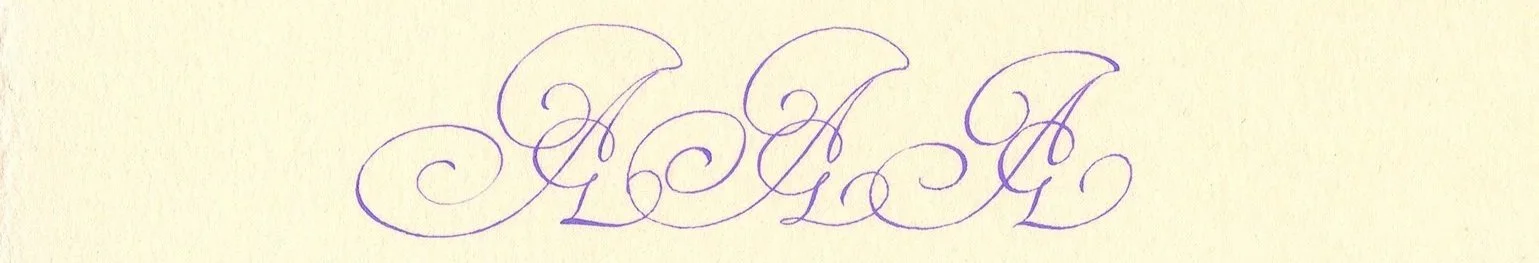
A variation of one of Van de Velde's capital A's, written three times in a row: first with a pointed pen nib in a straight holder, followed by a pointed pen nib in an oblique holder, and lastly with a broad edge nib. I used purple gouache for these on warm white hot press watercolor paper.
I didn’t play with swapping my grip too much for the swash on the first A with a pointed nib in a straight holder—you can see the shade sits lower in the curve toward the base compared to the swash on the second A, made with an oblique holder. In the second A the pointed nib is lined up for the slant of the script and opens easily for the swash, same in the base swash where the shade again lines up with the slant of the script. The final A made with a broad edged nib has a nice balance I think. I didn’t do much rotation, just let the angle dictate the thicks and thins.
I really like the fun flourish in the middle of the right stem of this A variant. I didn’t really focus too much on Van de Velde’s flourishing and decorative borders for this issue of the study blog, but he definitely enjoyed his elaborate loops.
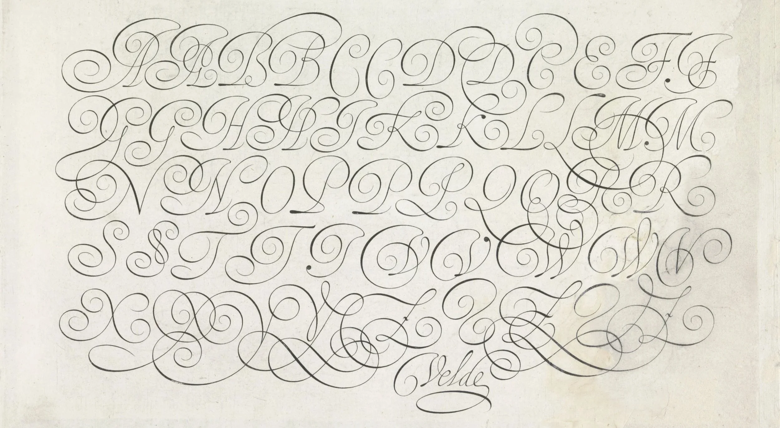
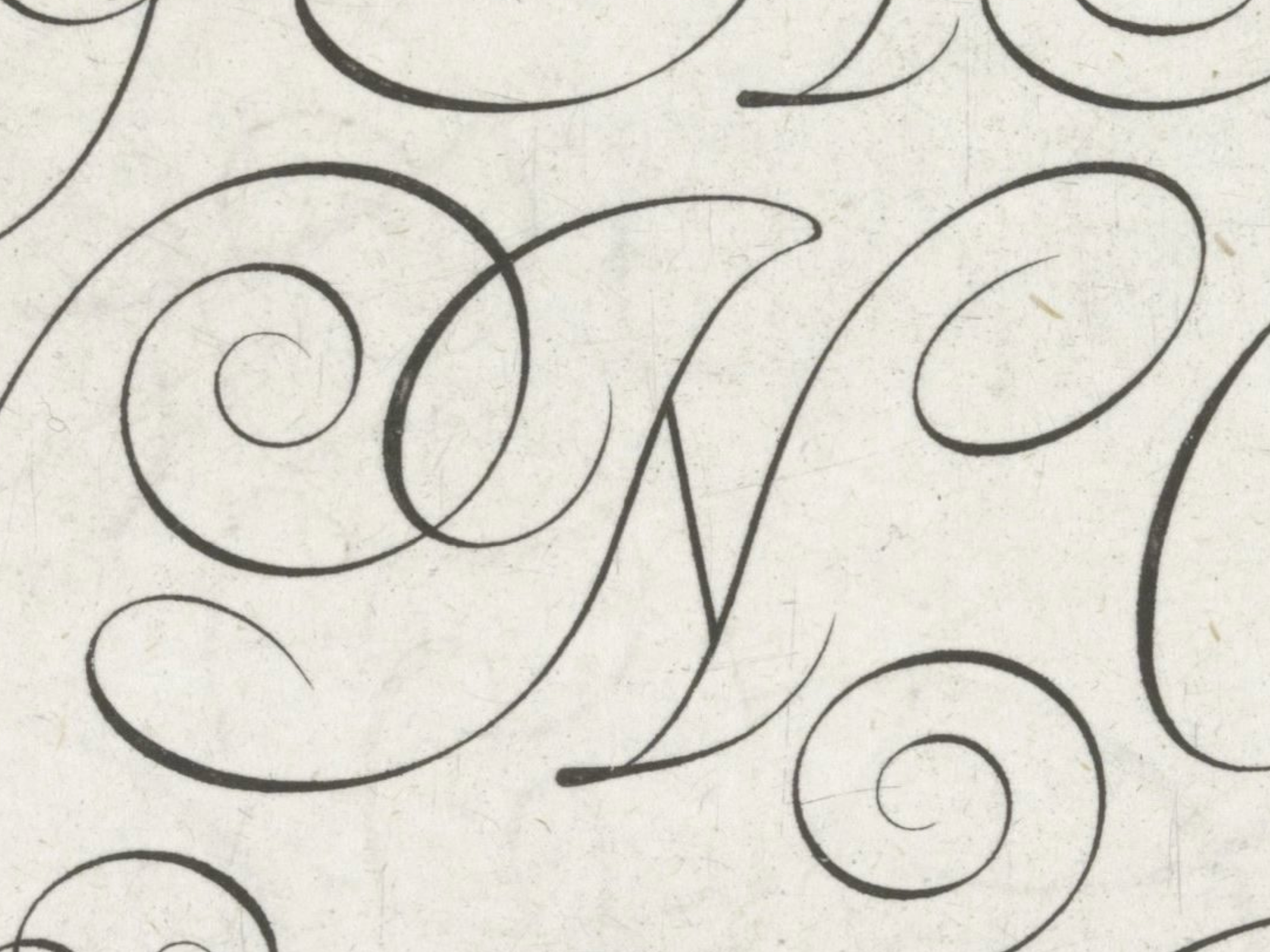
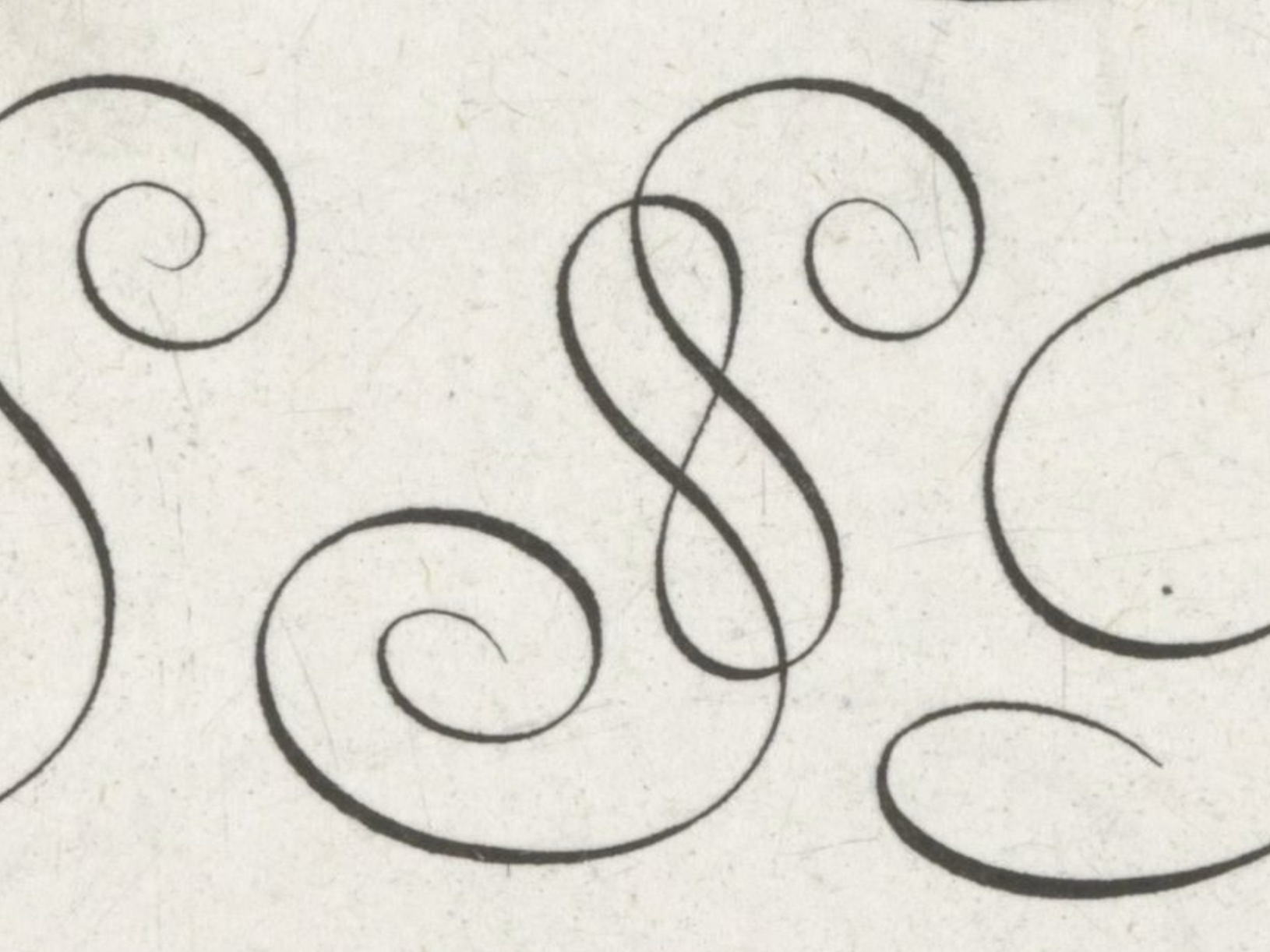
© Rijksmuseum - An engraved page of Van de Velde's exemplar for Italian flourished capital letterforms included in Spieghel der Schrijfkonste (Mirror of the Art of Writing), presumably engraved by Simon Frisius. I made a composite of two different versions of this page in the Rijksmuseum’s collection—part of the lettering was missing on the right side of one page, and the left side of the other page. You can find the originals at the following links. https://www.rijksmuseum.nl/nl/collectie/object/Schrijfvoorbeeld-het-alfabet-in-vijf-regels-kapitalen--e841484371d22b3e67500df15626f815?tab=data, https://www.rijksmuseum.nl/nl/collectie/object/Ontwerp-van-een-schrijfvoorbeeld-het-alfabet-in-vijf-regels-kapitalen--4a72a7e9a3d5f05c3ced6af9d2b43377?tab=data
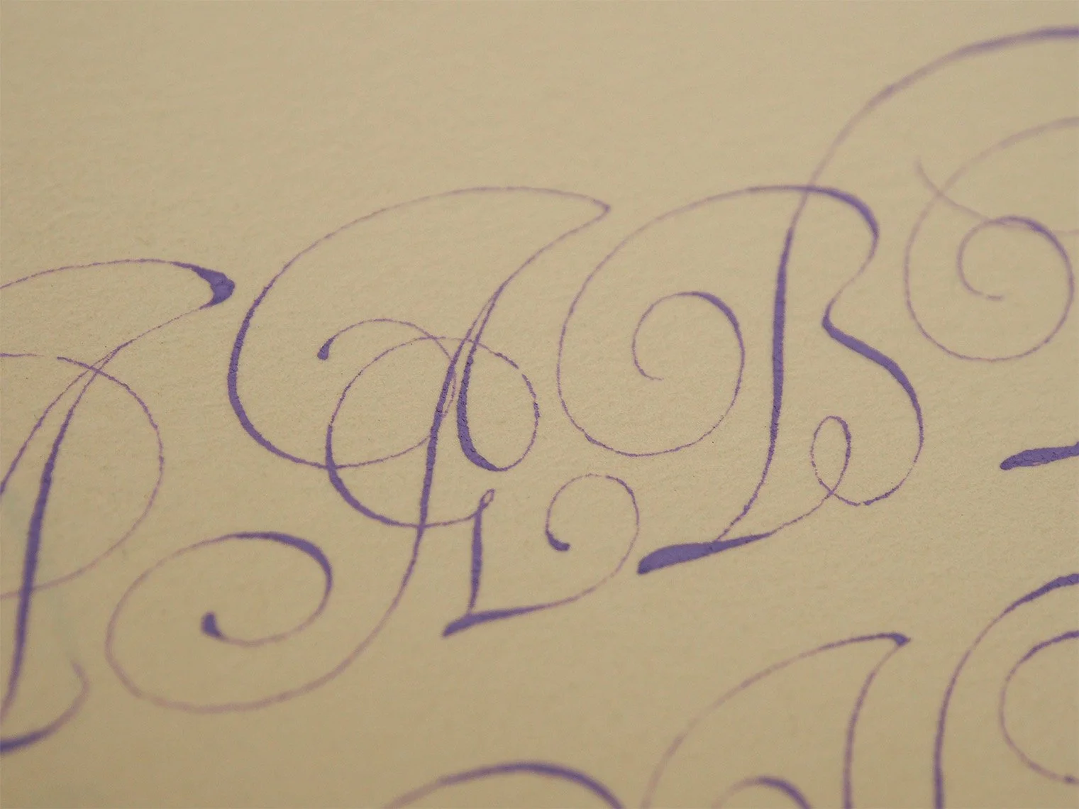
I really enjoyed duplicating Van Moten’s alphabet last month, so I decided to use Van de Velde’s copy book as I imagine it was intended, and attempt a copy of these flourished caps. I made up a guide sheet with consistent line heights, but opened up the interlinear space a bit. It makes the overall page less of a composed piece, but also makes the individual letters a bit easier to read. With everything so tightly spaced horizontally, I didn’t repeat letters that didn’t come off very well, just tried to embrace whatever came out 😅

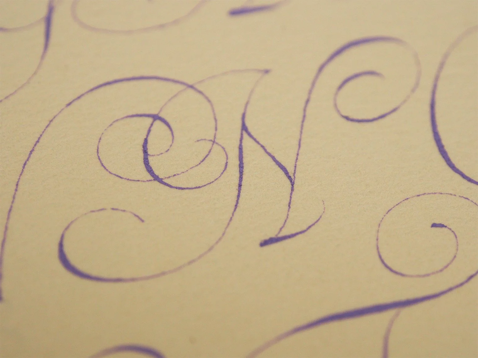
My full page copy of Jan Van de Velde's flourished Italian capitals from his copybook Spieghel der Schrijfkonste (Mirror of the Art of Writing), written in purple gouache on Arches text laid paper
I really love a lot of Van de Velde’s variants here. The second A and the first B are fun with the extra decorative loops that break the core forms. His first E makes sense to me, being familiar with all the lowercase e’s that have similar curled swashes off the top. I didn’t realize I failed to close the bowl of my E until I was taking pictures. I suppose that would help with recognition, but I think this form will always be seen as a C by contemporary readers. I’m also a fan of both his F variants. You may note after all this discussion of the shaded swashes that I left most of mine as hairlines. I debated playing with trying out both an offhand grip (like I often used for the clubbed ascenders), and a between the middle fingers grip, but decided I just wanted to focus on the core structures of the letters.
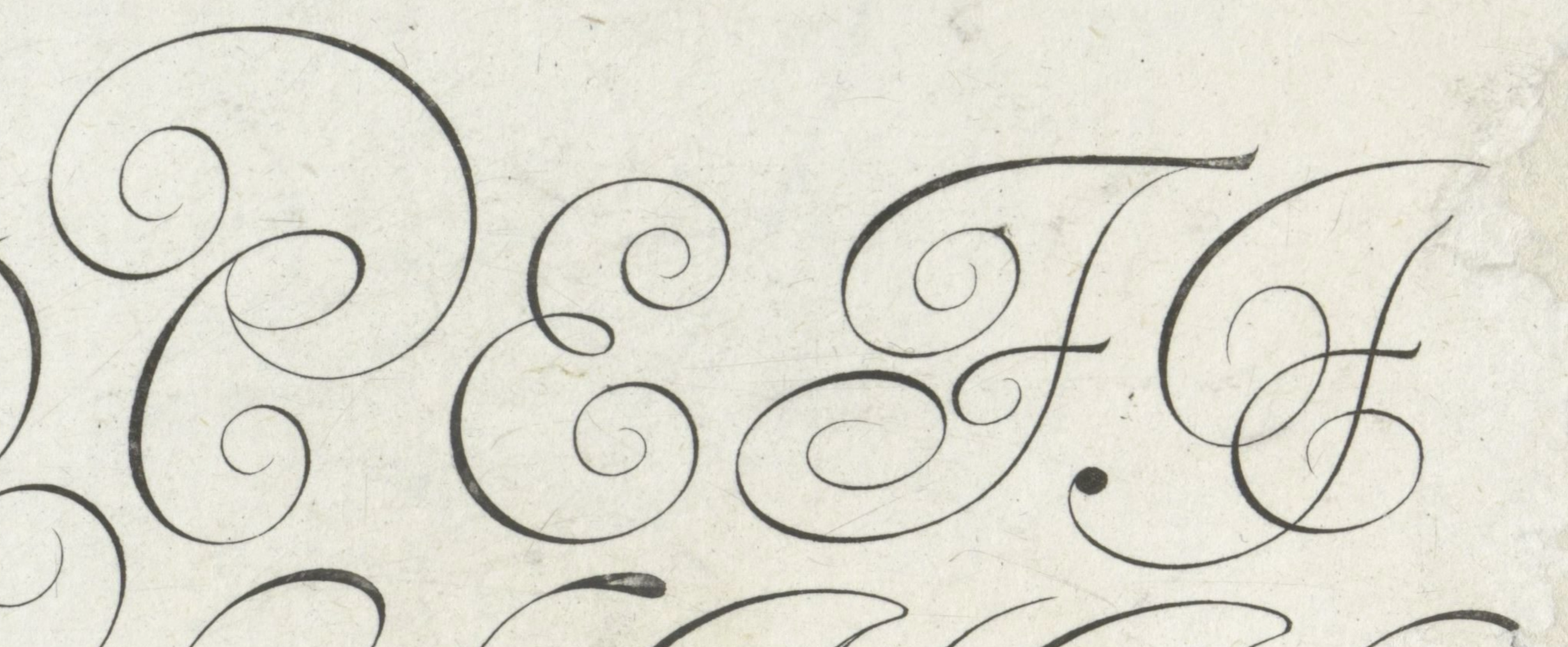
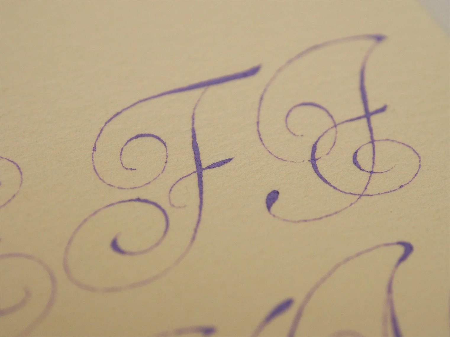
The second N, on the middle line is interesting. I’ve seen this form quite a bit, where the basic structure is virtually identical to the H except for the cross bar extending down at an angle instead of bisecting the stems on the level. What I haven’t noticed before is the little swash off the base of the right stem. I’m so used to that being the point of the N, it just feels weird to me. However, there really aren’t any instances in the script where a single stroke ends without some kind of curl or swash, so I suppose it would be out of character to do so here.
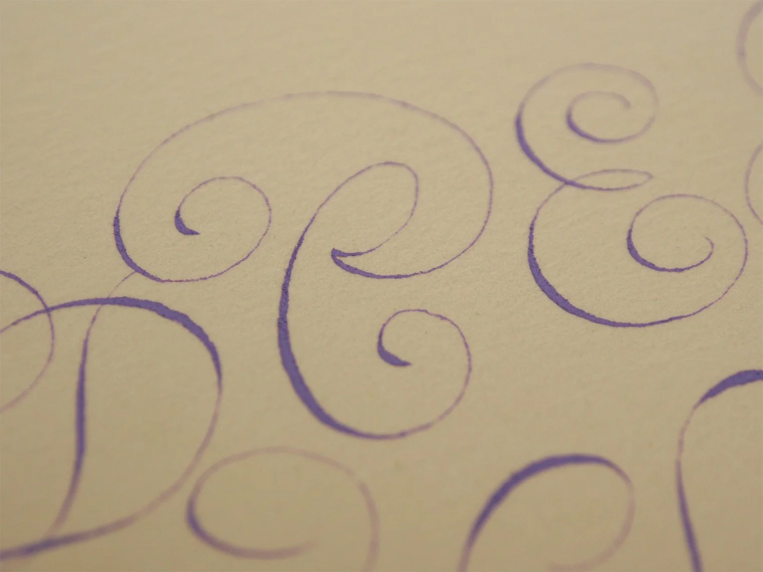
The S is where I think things start to go a little off the rails with the figure eights through the spine. It’s not totally there, but it feels like a curvy dip into cadels.
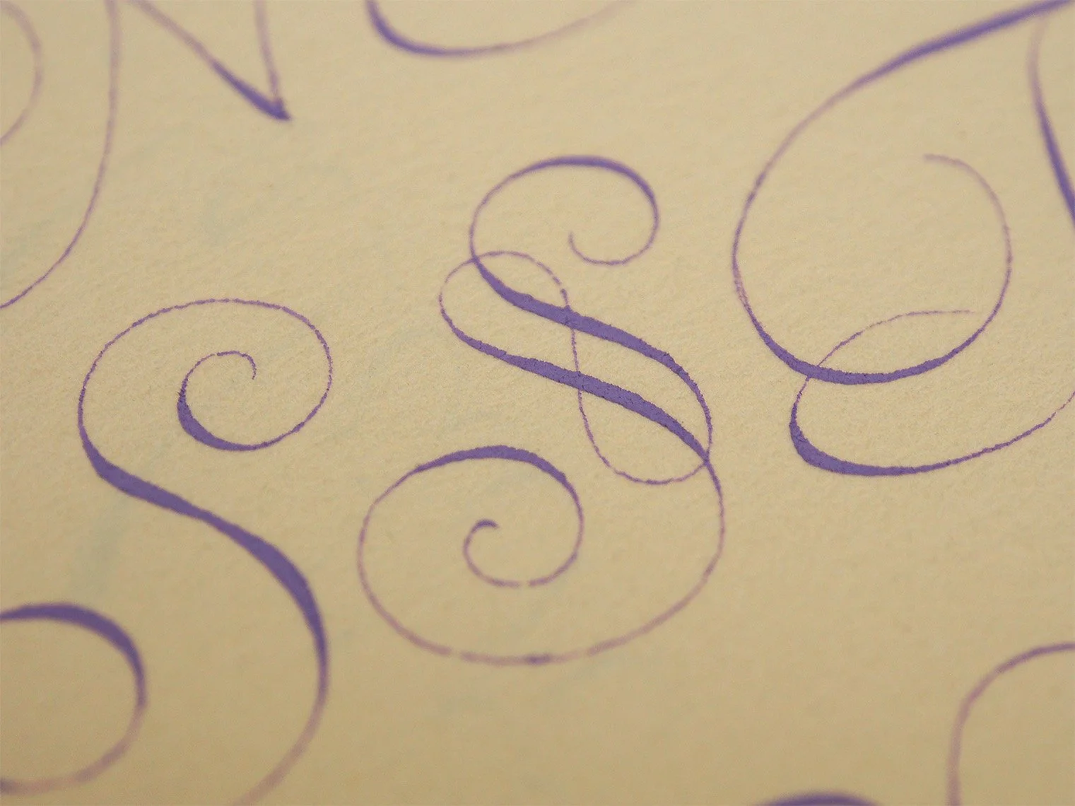
The bottom line is where it really starts to feel like the letters might have had a few drinks. The X to Y to Y to Z is quite a ride!

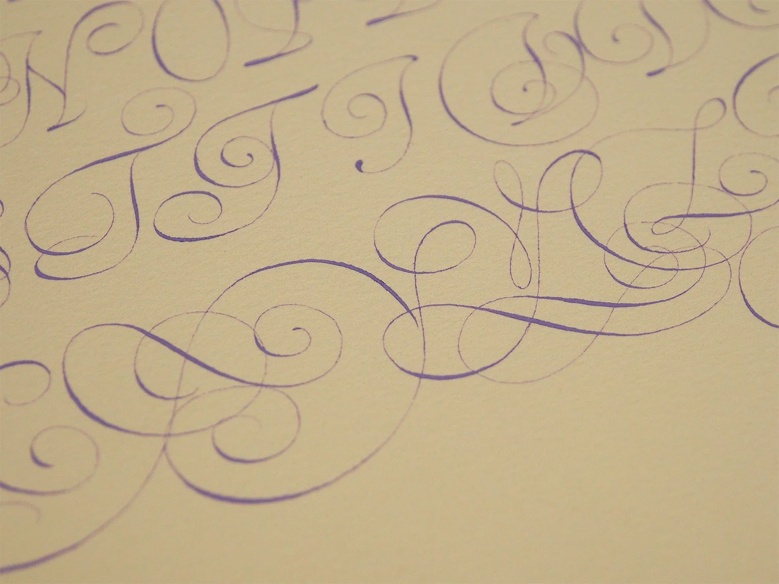
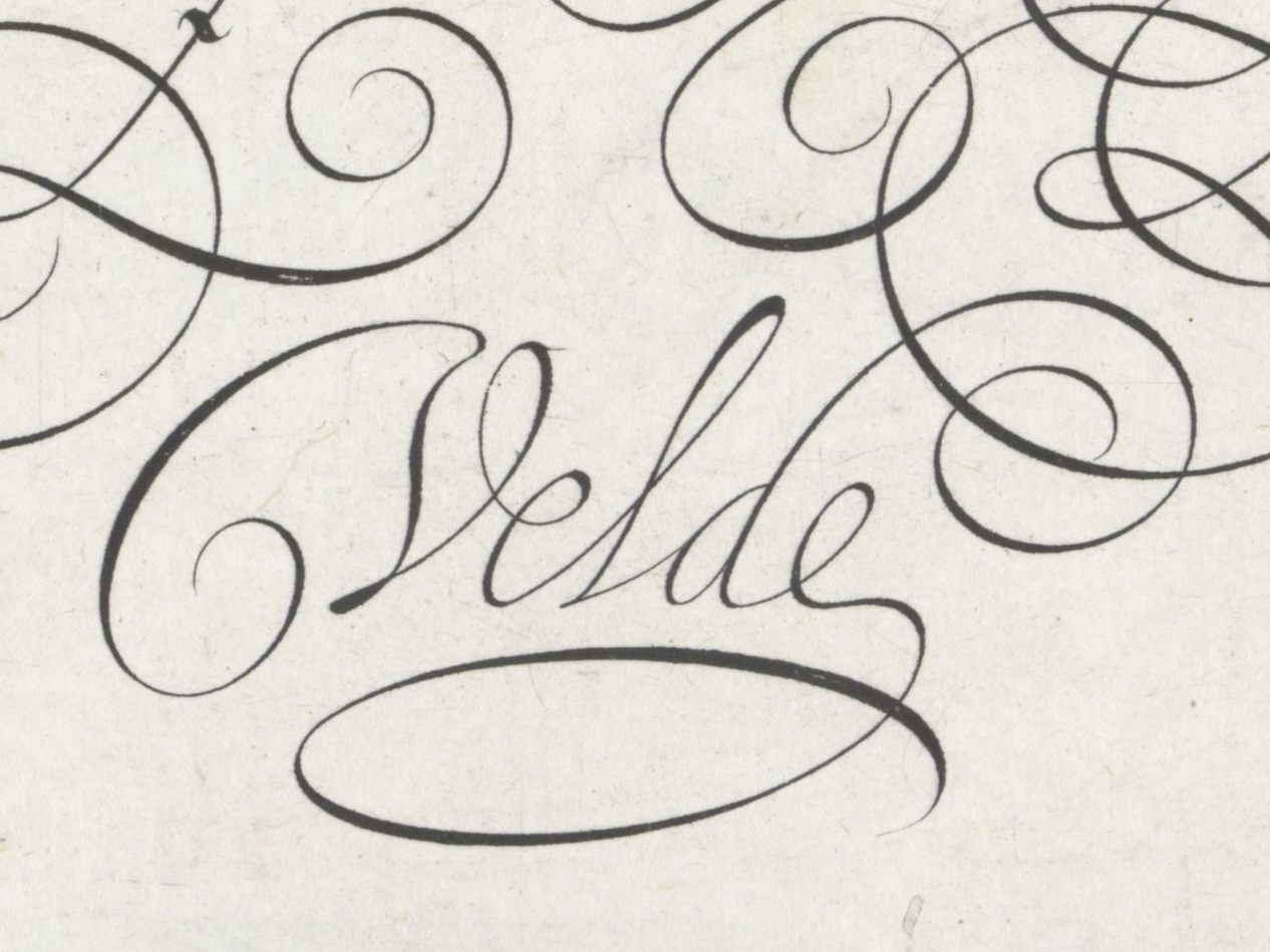
The signatures in copybooks are often super elaborate, I appreciate the relative simplicity of Van de Velde’s here with it tucked in between the flourishing of the second Y and the middle Z. The simple, but unexpected transition from the base of the e into the final looped swash is a nice ending to the full composition.
I hope you’ve enjoyed this journey into Van de Velde land, and encourage you to look up more of his work.
Next Up…
As usual I haven’t made a final decision yet on my focus for March. I’m leaning towards English roundhand or copperplate. I’m tempted to try out the between the fingers grip with a straight holder to line it up with the script slant. Could be fun? Or a lovely disaster?
If there’s something you’re interested in or would like to learn more about, please let me know. Requests and suggestions are always welcome and appreciated :)
Thanks for studying along with me!