Alphabets and Angles with J. van Moten
Hello friends
Welcome to the January 2026 issue of Books with Hook. If it’s your first time here, this is a monthly study blog focused on historical calligraphic works, manuscripts, and related printed materials.
You can find past entries here: https://www.lindsey-hook.com/books-with-hook/
If you’d like to follow along for future posts, please join my mailing list.
Alphabets and Angles
I kicked off the year by digging into manuscripts specifically, and looking at an Italian hand alphabet from the late 1500’s by a scribe I haven’t previously encountered. I’m planning on offering an intro course on Italian hand this spring, so this piece caught my attention for being hand-written and containing the complete lowercase alphabet—so many don’t have k’s!

This page is part of an album in the collection of the Newberry. I checked it out because the majority of the leaves are tentatively attributed to Jan van de Velde, and I was really hoping to see some of his handwritten Italian in person. The album does contain a number of beautiful pages with a variety of broad edge scripts, but the Italian hand example seems to have been written by a J. van Moten instead of van de Velde. I couldn’t find any information about him, so I don’t know if he was a student, or a fellow scribe.
Unfortunately, the album hasn’t been digitized and shared by the Newberry as of the time of writing, but you can find the full info here:
https://i-share-nby.primo.exlibrisgroup.com/permalink/01CARLI_NBY/i5mcb2/alma997512908805867
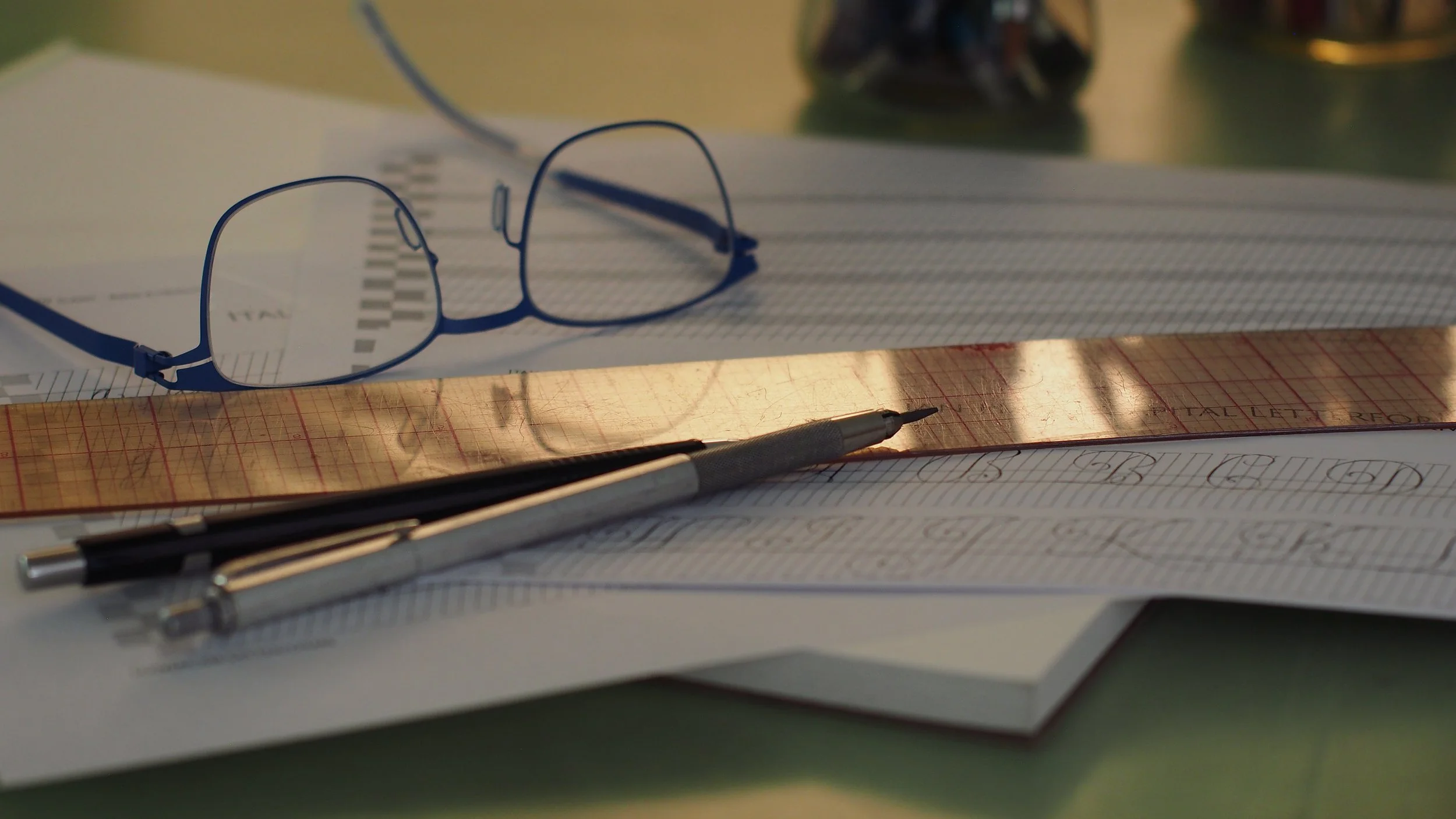
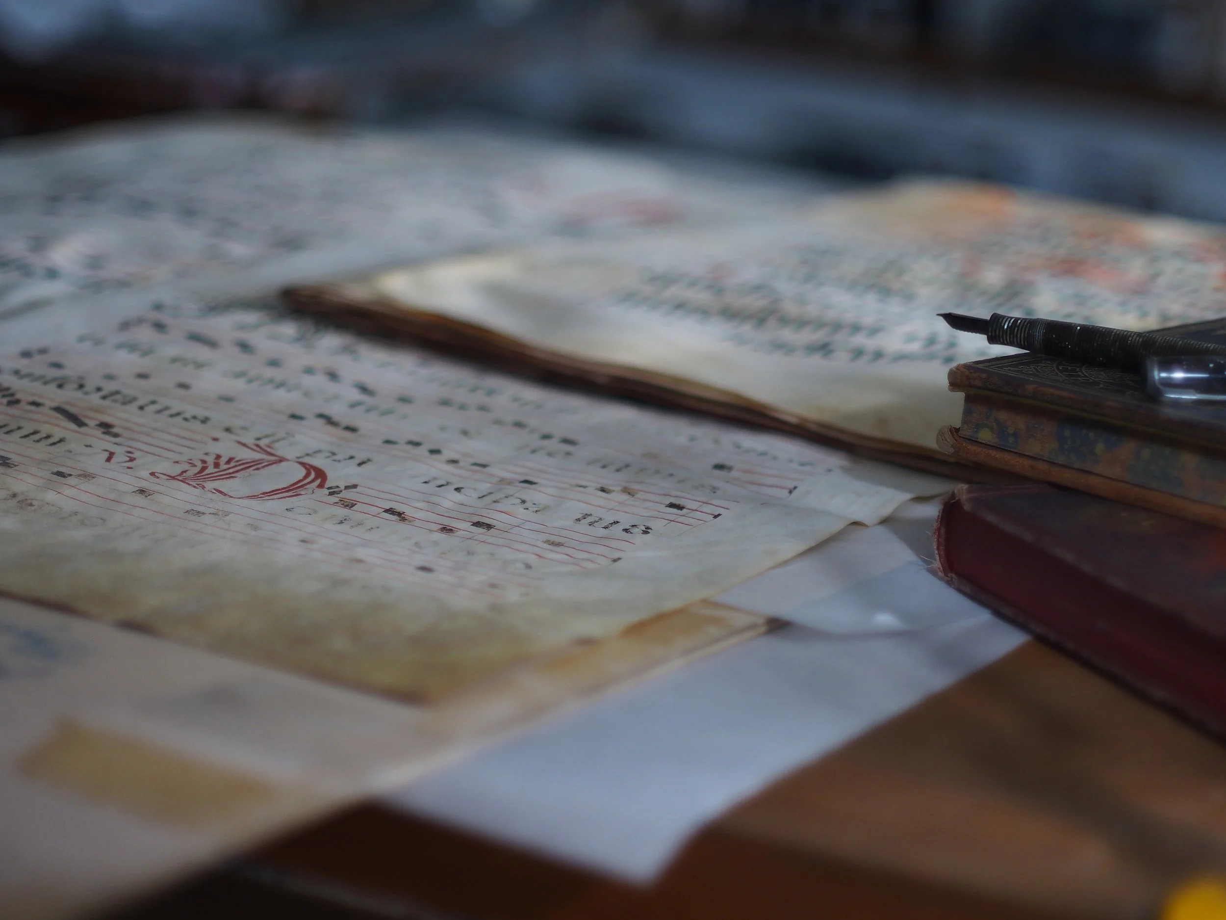
I didn’t make a note of the x-height, but the pages are around 8’x11.5” (20x30cm), and in very good condition. I took a bunch of closeups to help see where things have been retouched. All the photos here are my own.
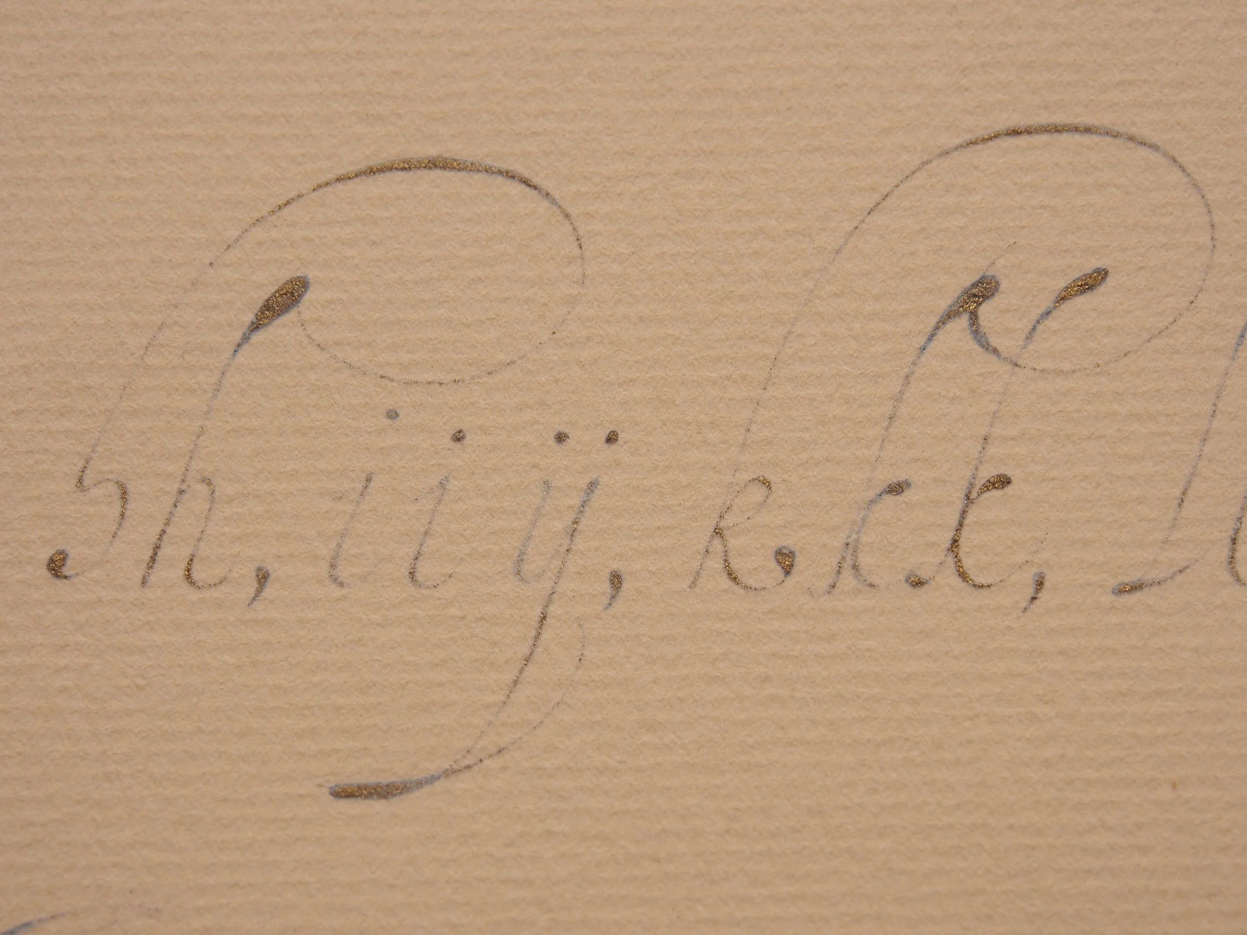
I’ve been thinking a lot about pen angles lately. For most of the scripts I consider ‘pointed-pen’ based (copperplate, engrosser’s, modern etc…) the shades are aligned with the slant of the script. The nib is held in line with the slant either with an oblique holder, an unusual grip (for contemporary writers at least), or by turning the angle of the page. Italian hand is different however—the line-weight is at odds with the slant. This unique characteristic is a big part of why the script has such a delicate quality, with all the superfine linework and little accents and blobs dancing across the page.
When I first started studying Italian hand, I approached this unfamiliar lineweighting through pressure control (and retouching), like you might with Spencerian, where the nib barely skims the page except for brief moments of downforce. Over the years though, I’ve come to understand that this approach is based in a fundamentally modern misunderstanding of the script, overlooking how it was developed and written. 15th century scribes had no concept of metal pointed pen nibs. They were writing this style of Italian hand with finely cut quills. There was no ‘copperplate’ with shaded 52–55° slant lines. Their context was predominantly what we now think of as broad edge scripts, where line weight came somewhat from pressure, and sometimes from retouching, but predominantly through the angle the quill was held at (30°, 45°. etc…). In this context, the locations of the shades in Italian hand suddenly make a lot more sense. If your nib is held like a broad pen, in a straight holder, so that the tines will expand out at a roughly 45° angle (against the slant of the script), you will naturally get very little weight throughout your writing, with little bits of density popping up on letterforms where the stroke comes down against the slant.
I know I’ve mentioned this before (I’m pretty sure I talked about it in relation to Marie Pavie’s book), but it’s been even more top of mind for me recently with putting together teaching materials for a course—so—pen angles were a focal point when looking at van Moten’s alphabet and I decided to copy the page, being very conscious of how I was angling and rotating my nib while writing.
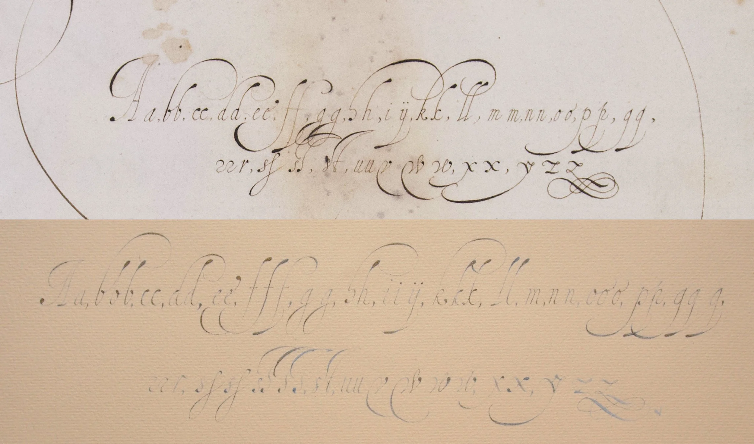
I think it’s both fun and informative to copy work while studying. I always discover something I hadn’t considered until I’m there with the nib on the page, and realize I don’t actually know where I’m going with it. I certainly didn’t make an exact copy. I opened up the interlinear spacing to avoid the tangle of all the overlapping ascenders and descenders of the f’s, g’s, and s’s. I also rewrote a few letters where I felt my first attempt diverged to the point where it became a poor representation of van Moten’s source letter. Otherwise, I tried to stay pretty true to his alphabet.
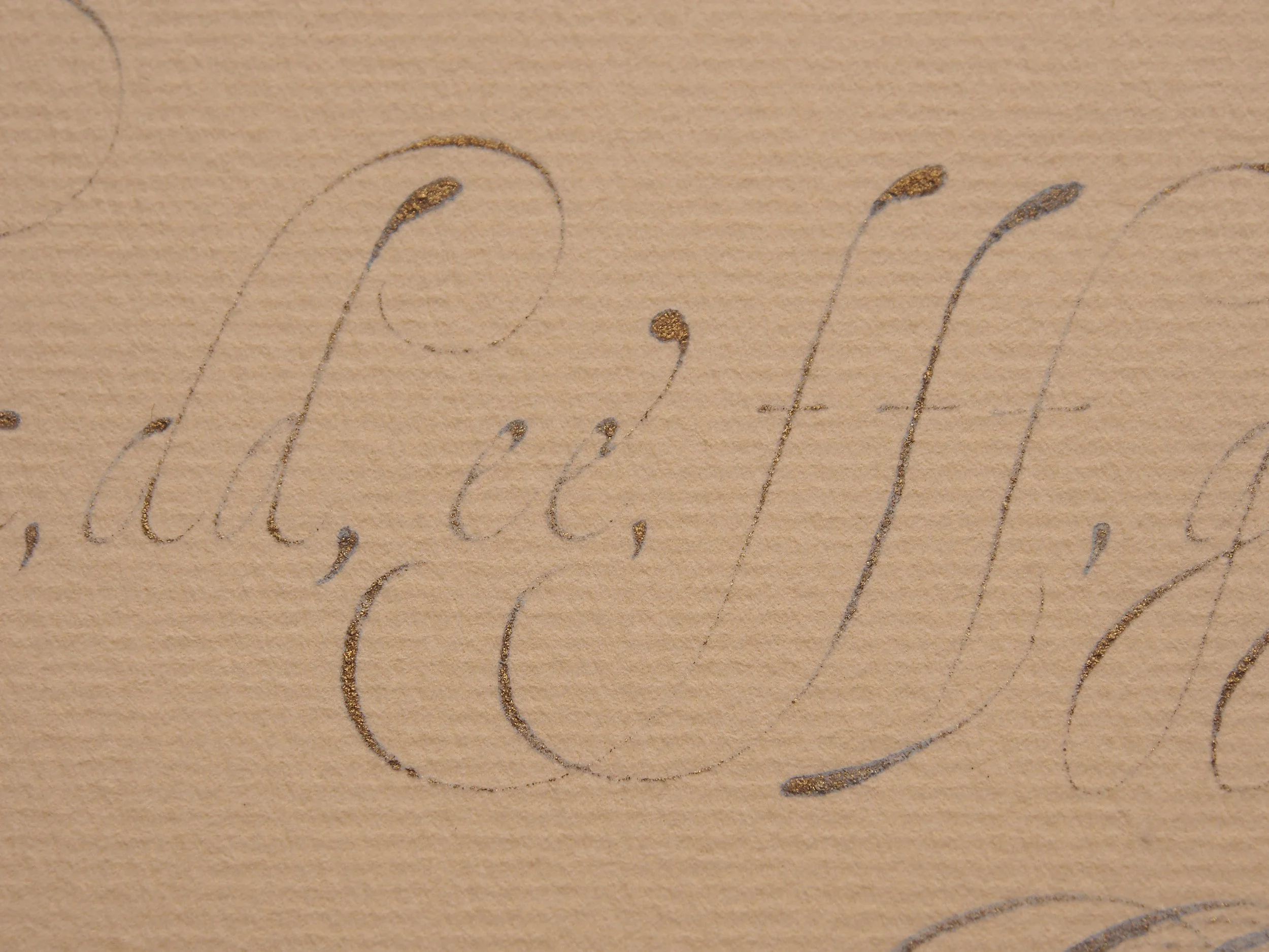
The b’s are a good example of this. Van Moten pinches the bases of his b’s almost to a point, differentiating the core form from the rounded almond form that runs through other letters with bowls (a, c, d, e, g, etc…). I was sloppy on my second b and rounded the base, so I added a third b as a correction with the pointed base.
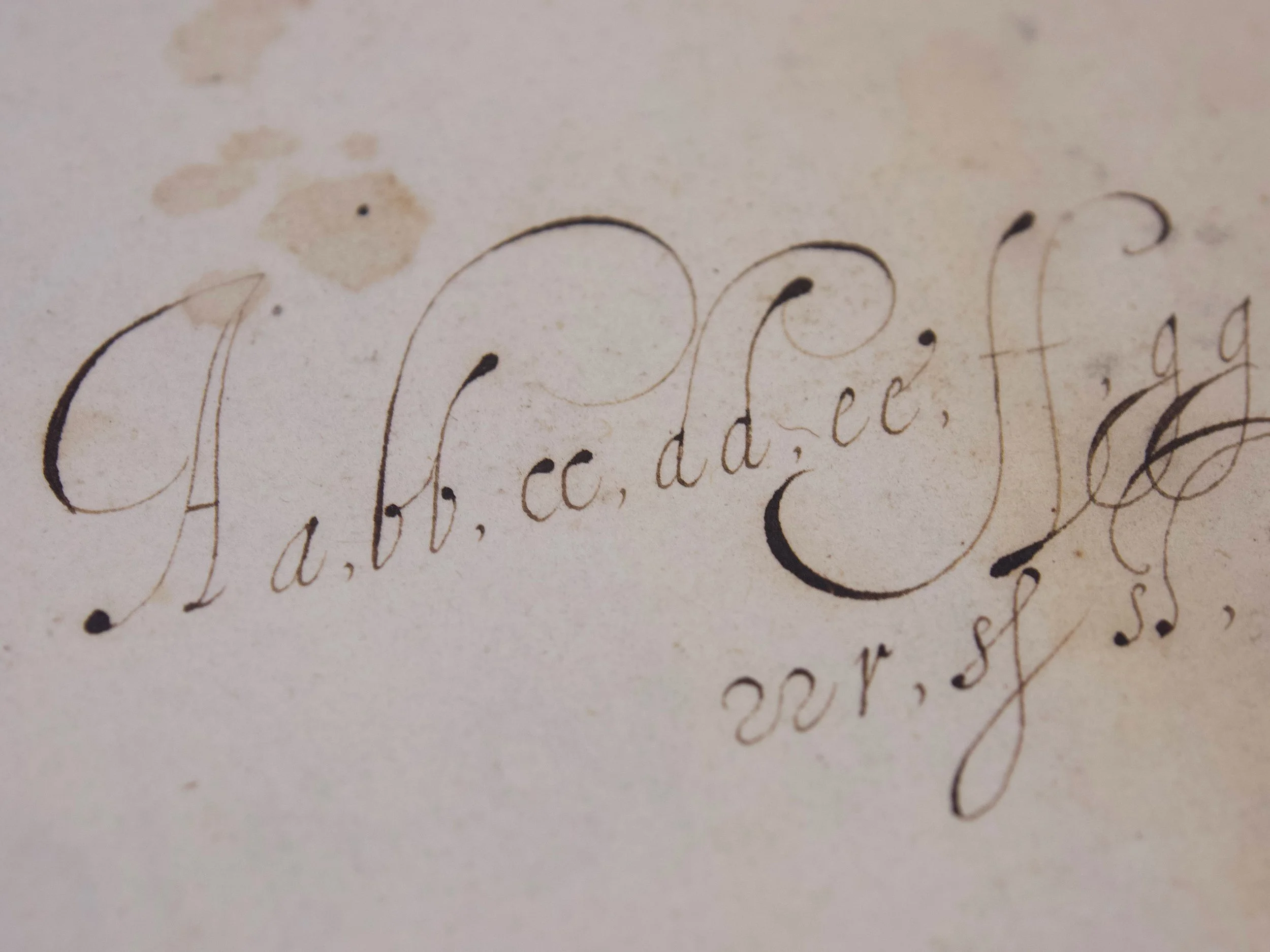
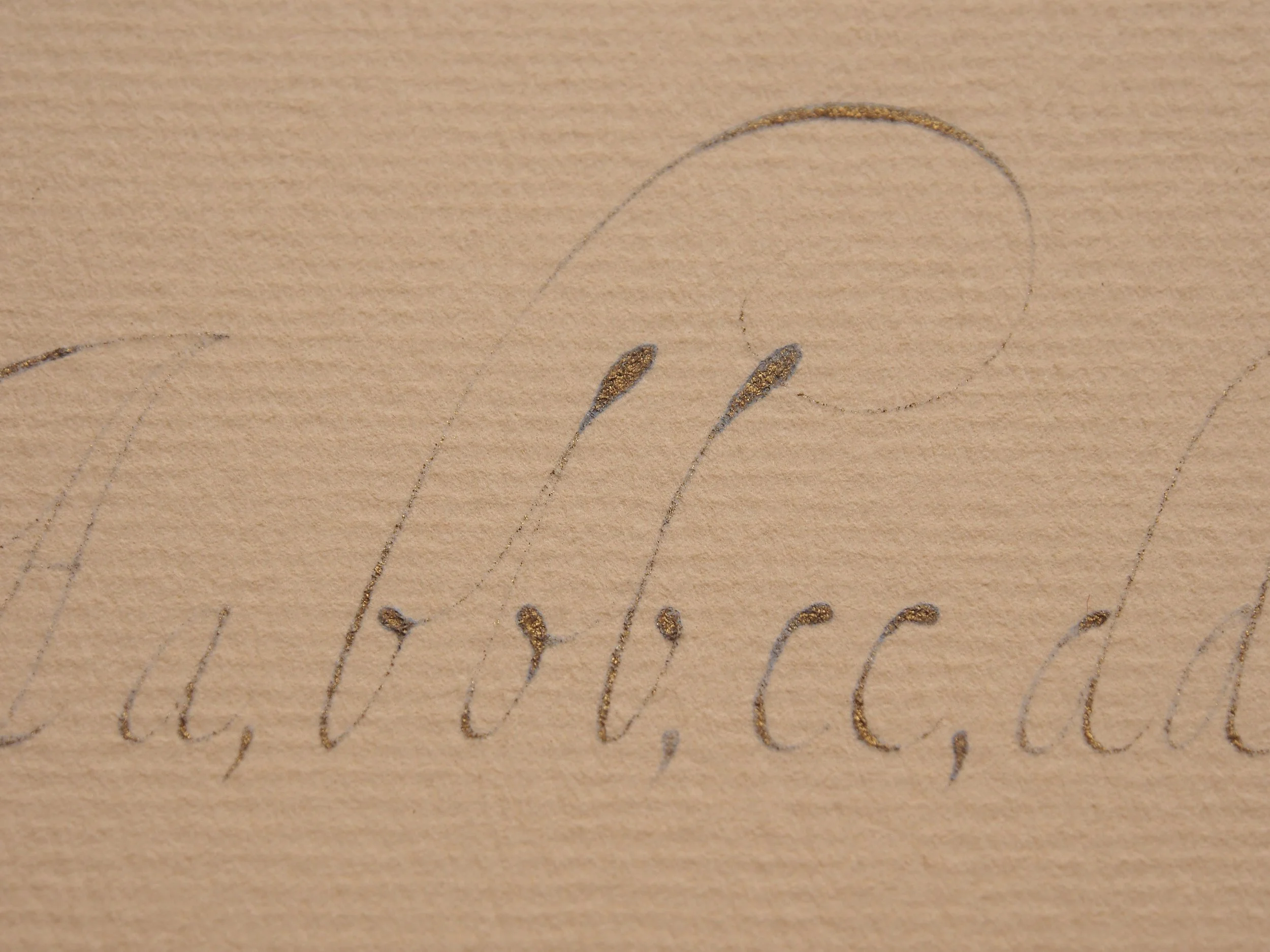
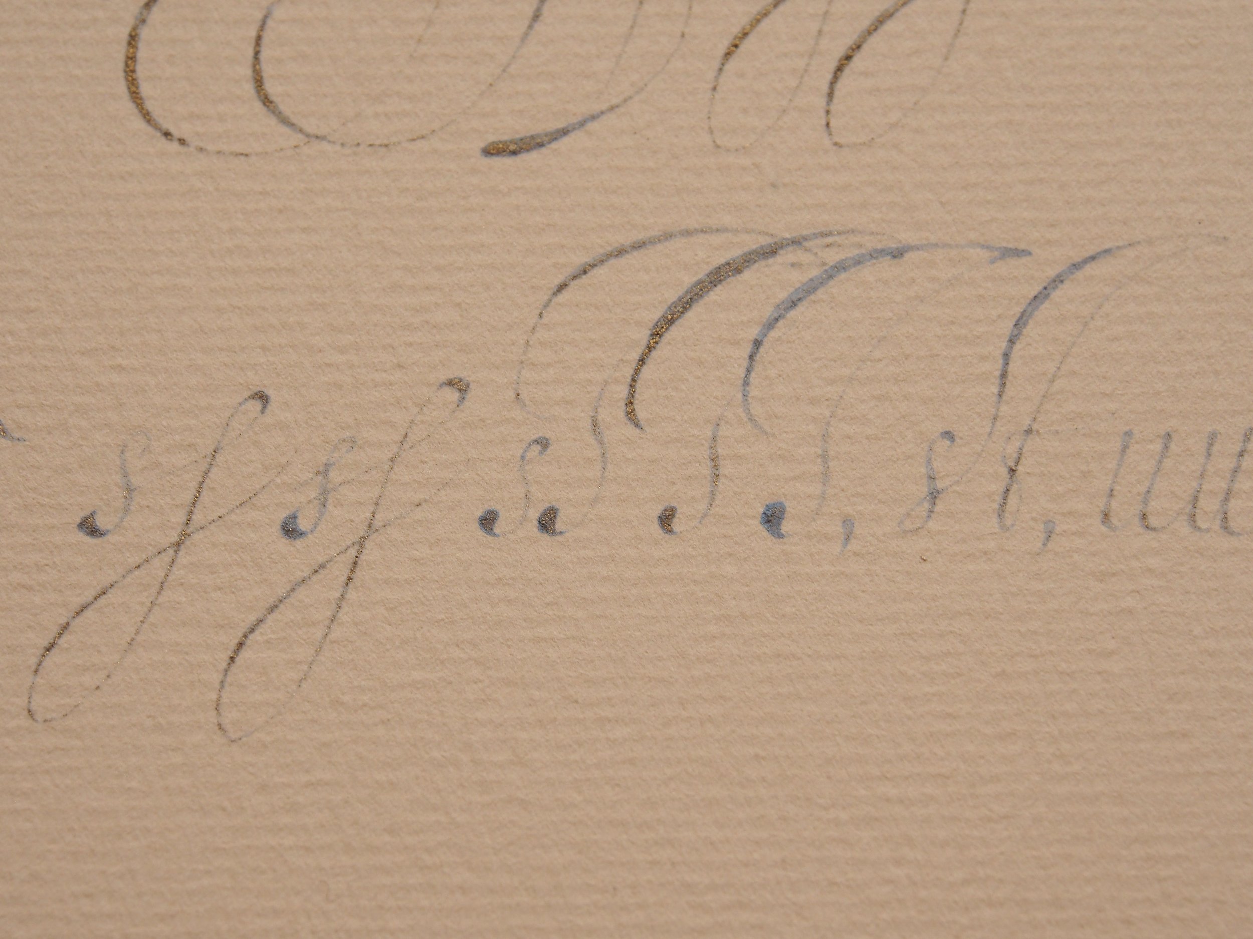
It’s interesting that van Moten uses this pointed base form in the b, but doesn’t include it for the v. I feel like I see this fairly often with other examples, but he only includes a sharply pointed v. He does however include a really lovely w variant with it. I’m a big fan of both of his w’s. A lot of lowercase w’s I see feel awkward or out of character for the script, but both of his feel very natural. Those x’s though… I’m not a fan. They’re so heavy and wide compared to everything else. He does add similar weight in the y and the z, but still, they just don’t sit right for me. They are a perfect example though, of how the line naturally expands when you hold the nib at around a 45° angle—that top left to bottom right downstroke is perfectly aligned to open the tines, especially if it’s done super wide like his is.

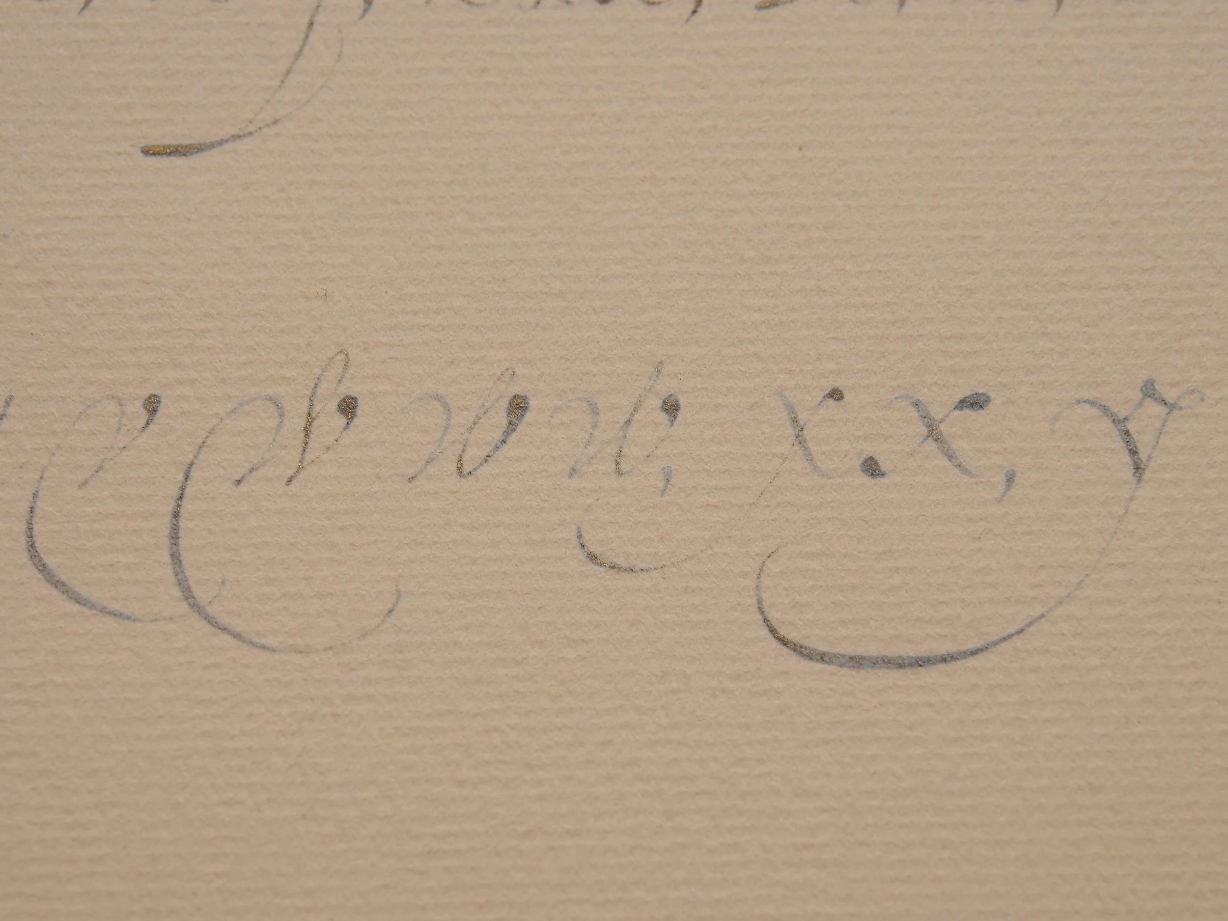
Also of note here, with v, w, and x: you can clearly see the joins where the swashed strokes were added after the fact, and again, those swashes expand just like expected for a flexible quill being held with the slit at a roughly 45° angle. You can see both the retouching and the joins again in his ascenders and descenders. For the big looped ascenders, I think he entered the strokes with the quill at 45° and then rotated it closer to 90° while increasing pressure. I may have over rotated a bit in my copies, the shaded tops of the swashes are too horizontal.
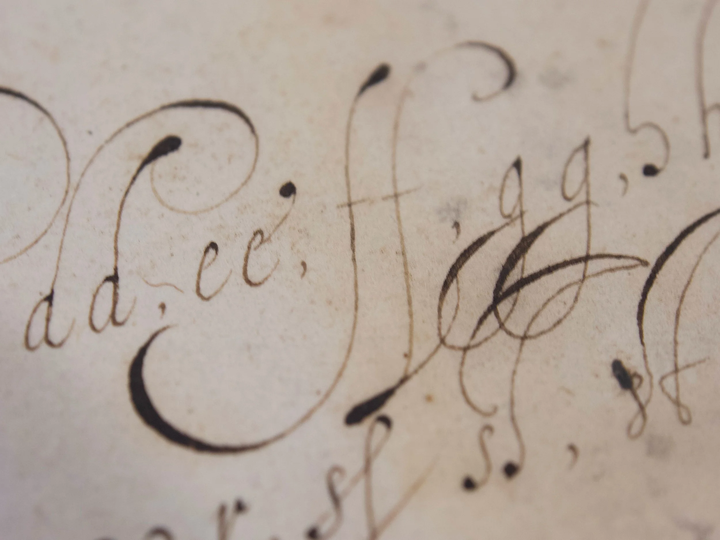
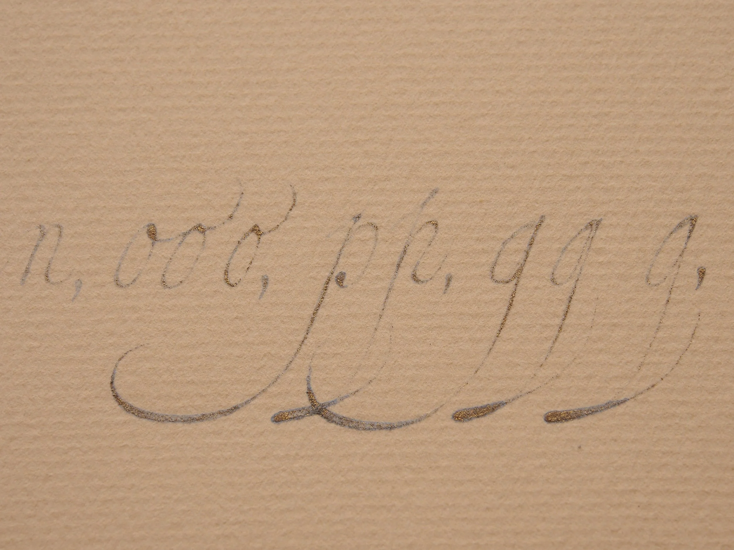
As mentioned above, I love that he’s included k’s. The first feels out of character to me, although it’s a variant I see pretty often. I usually do something closer to the second example, combining an l with a c. I never loop the stem back to the left like he does with a little terminal. I could see using this variant along with an x form composed of this and the c form. It would make for nice continuity through the script.
He also includes some fun s ligatures. My attempts are a perfect example of not realizing I didn’t know where I was going until I got started. The tall swashed connectors don’t look out of place on the page. They line up relatively well with the swashed descender loops of the g’s. I think they’re written from the base up, sort of like the big swashed ascender loops, but the shades are at such a different angle, they felt awkward to me written both bottom up and top down. Each time I began, I felt like I was ready to go, only to find I was most certainly not.

Final notes: The big looped q is fun, but I try to avoid these because everyone now just reads them as a g. I always have to remind myself that the descender loop on g’s is always closed and directed back up to the baseline, usually with a shade on the left side, if it’s open, no matter how much it looks like a g to me, it’s a q. I was also interested to see how high above the x-height van Moten started the stem for his second q. He does it a bit on his g’s too, but that second q has such a spike sticking out the top of it. I wonder if it was intentional—could be an interesting way to differentiate the q if done consistently.

If you’ve made it this far, thanks for studying with me! I recorded myself copying van Moten’s alphabet and am hoping to make some time in the next week or two to edit together different camera angles looking at how I angled and rotated my nib while writing. I’ll post those to YouTube and social media once they’re ready.
Next Up…
I’m planning on sticking with Italian hand for Feb, but haven’t picked a specific source to focus on yet. If there’s something you’re interested in or would like to learn more about, please let me know. Requests and suggestions are always welcome and appreciated :)
Thanks for studying along with me!