A Speedball History Mystery
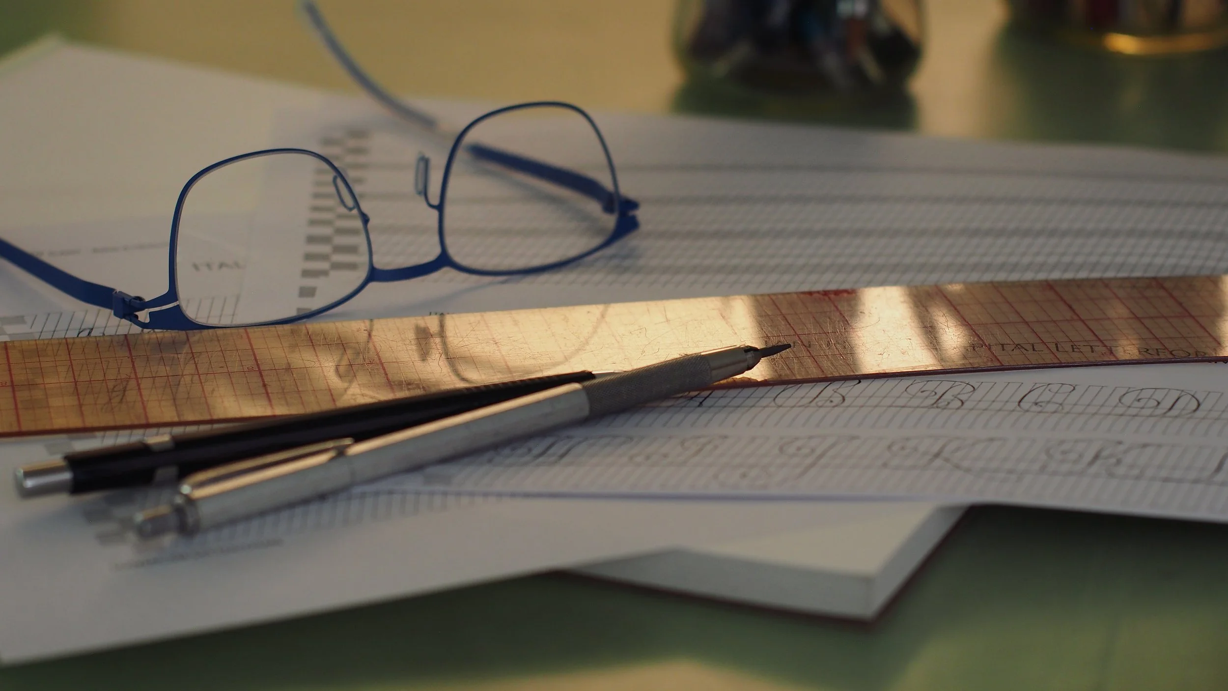
My copy of Ross F. George’s Round Hand Script (copperplate calligraphy) exemplar from the 13th edition of the Speedball Textbook, penned with a Hunt 101 nib and Dr. Ph. Martin’s bleedproof white ink on Fabriano Ingres paper
Hello friends
Welcome to the March/April 2026 issue of Books with Hook. If it’s your first time here, this is a study blog focused on historical calligraphic works, manuscripts, and related printed materials.
You can find past entries here: https://www.lindsey-hook.com/books-with-hook/
If you’d like to follow along for future posts, please join my mailing list.
A broad in an Oblique?!
Can you write copperplate with a broad-edge nib in an oblique holder? Should you write copperplate with a broad-edge in an oblique? For this month’s study blog, I went down a bit of a lettering history hole. I hope you’re up for a bit of Speedball Textbook rabbiting!
If you’ve been following along with my recent study blogs and social media, you may know that I’ve been deep in Italian Hand history. As part of that research, I’ve been examining how contemporary calligraphy tools relate to traditional scripts like cancellaresca corsiva, and all the various Italian batarde scripts from the 17th c. which were written with quills.
Understanding the implications of the type of nib you use and the choice between using an oblique holder (where the nib is aligned with the slant of the script) vs a straight holder (where the nib is not aligned with the slant of the script) is key in learning the unique characteristics of Italian Hand. These topics were front of mind for me to look at in March’s workshop on Italian Hand, so, at the beginning of the month I shared a related video on instagram. If you’re curious, you can find the post here https://www.instagram.com/reel/DVbag2rEQXA. It shows an Italian capital A written three different ways: with a pointed nib in a straight holder; a pointed nib in an oblique holder; and a fine, broadedge nib (a mitchell 5) in a straight holder.
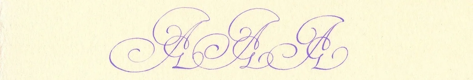
Variations of an Italian Hand A based on one of Jan Van de Velde's capitals, written first with a pointed pen nib in a straight holder, followed by a pointed pen nib in an oblique holder, and lastly with a broad edge nib. I used purple gouache for these on warm white hot press watercolor paper.
Sarah Schulz (@onyourleftcalligraphy) commented that older issues of the Speedball Textbook recommended using fine broad-edge nibs for round hand script (aka copperplate) too. Copperplate as a general style evolved out of English round hand, which—like Italian Hand—was traditionally written with quills, so the connection to a flexible writing tip with a fine edge made sense to me, but I was still surprised. And thus began my month of digging!
A bit of an introduction to the Speedball Textbook for anyone unfamiliar. For well over 100 years, this little book has been the entry point for countless people into the vast world of calligraphy and lettering. It was initially authored by Ross F. George and published by the Hunt Manufacturing Company as an instructional manual on commercial lettering. George was a commercial sign painter in Seattle (hello hometown love ❤️) who trained under, and then collaborated with William Hugh Gordon to invent “Speedball” pen nibs around 1914. You can find a copy of an early instructional pamphlet promoting the pens here: https://hdl.handle.net/2027/loc.ark:/13960/t5gb2r89r.
![Cover of Gordon & George, Seattle. [from old catalog]. Presenting the Speed-ball Pen: With Alphabets. Seattle: Wn., Gordon & George, 1915, care of the HathiTrust and the Library of Congress](https://images.squarespace-cdn.com/content/v1/556fc3dbe4b072434a9c145a/f901843d-f467-42a0-afcb-242e016891b2/Gordon-%26-George%2C-Seattle_Hathi-Trust-Library-of-Congress_MIXED-SCRIPTS_Presenting-the-speed-ball-pen-with-alphabets_PRIMARY_1915_loc.ark__13960_t5gb2r89r-seq_3.jpg)
Cover image: Gordon & George, Seattle. [from old catalog]. Presenting the Speed-ball Pen: With Alphabets. Seattle: Wn., Gordon & George, 1915. Scan care of HathiTrust and the Library of Congress public domain content
Gordon and George licensed production of the pens to the Hunt Manufacturing Co. who also took up publication of the textbook. George authored the first 17 editions. His final contributions to the textbook were included in the 18th edition, published in 1960 after George’s death in 1959.
Over the decades, the Speedball Textbook grew to become much more than a promotional trade publication for Speedball pens. The most recent 25th edition was published in 2021, and I understand that a 26th edition is due out this year. These current editions contain examples of all kinds of calligraphy along with practical instruction. Thumbing through is like a mini survey of the last 100 years of western lettering and penmanship.
All of this is to say that the Speedball Textbook is pretty familiar to me. I don’t remember whether it was my first calligraphy instruction manual, but it was definitely in the mix. I have my great-grandfather’s copy of the 12th edition, as well as my copy of the 22nd edition from when I was kid.
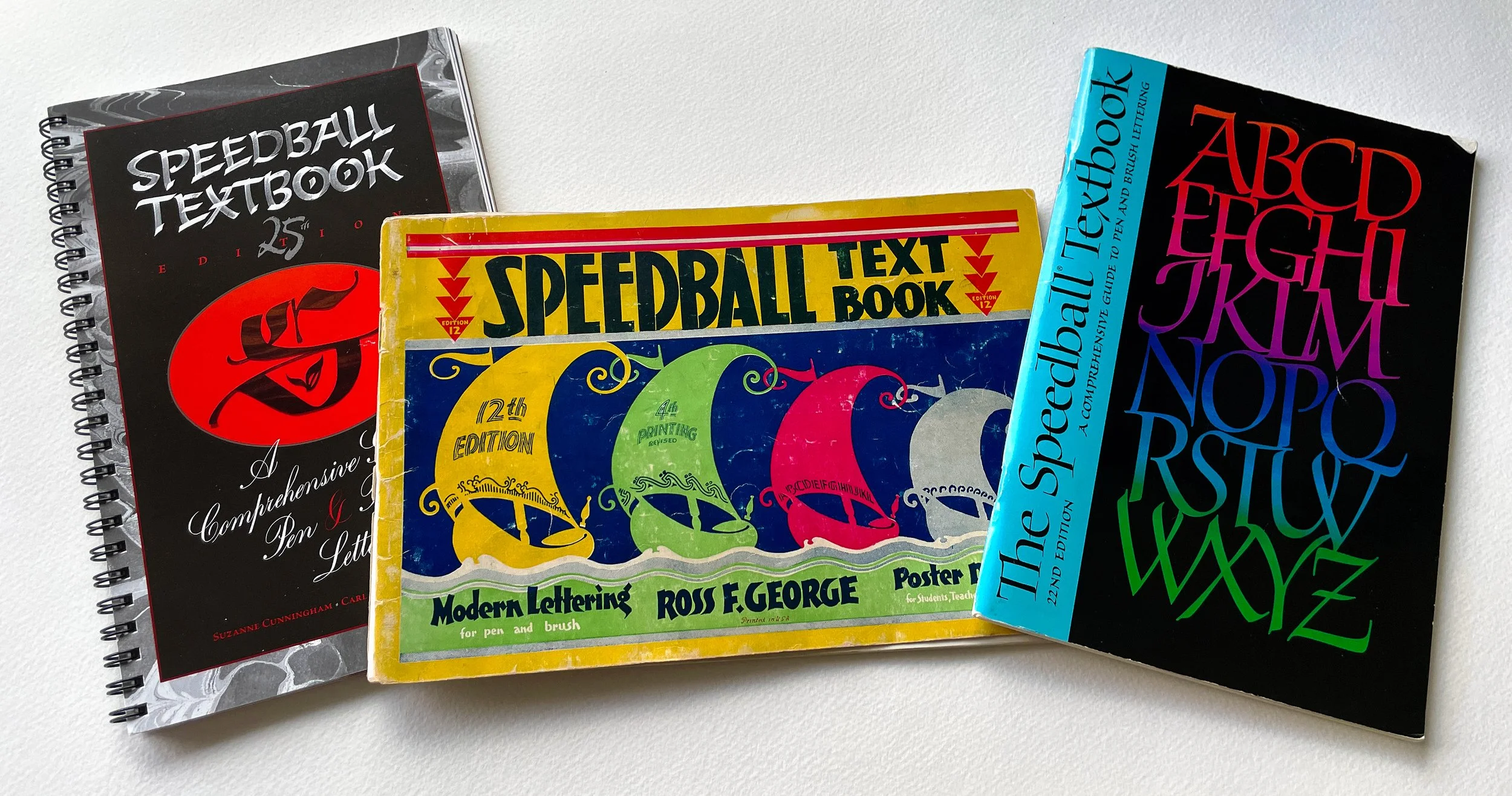
My little personal Speedball Textbook library
It had been quite a while since I’d looked at any of my copies when I read Sarah’s comment, but in my memory, none of the copperplate examples I’d seen seemed like they could have been penned with a broad-edge nib, even a very fine one. I pulled the 22nd edition off the shelf, and only found a set of capitals by Mike Kesceg, and an alphabet exemplar by Caroline Paget Leake. I pulled out the 12th edition from 1935, and there it was, George’s Engrossing Script exemplar on page 64. The exemplar itself has no mention of the pen used, but the facing page shows script samples for diploma text, and includes a footnote that the Engrosser’s Script “was lettered with a C-6 pen in an oblique holder”. A broad-edge nib in an oblique holder? In the 30’s? People use all kinds of nibs and pens and brushes in all kinds of ways. George was a sign painter, graphic designer and inventor. Did he really stick a C-6 in an oblique?
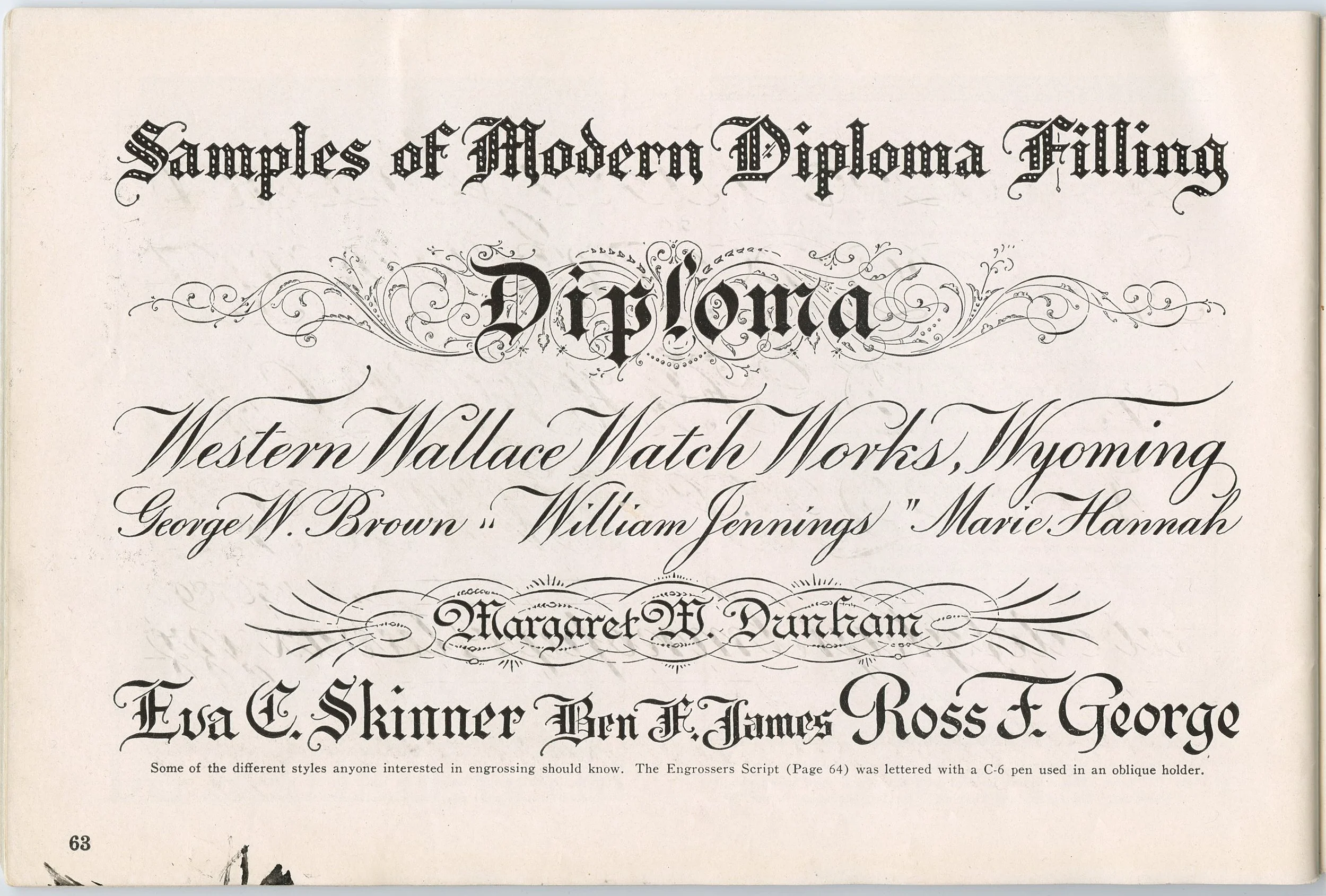
Speedball Textbook 12th edition, p.63 with Ross F. George’s “Western Wallace Watch Works” sample text, and a footnote stating the Engrosser’s Script on p.64 was lettered with a C-6 (very fine broad-edge) nib.
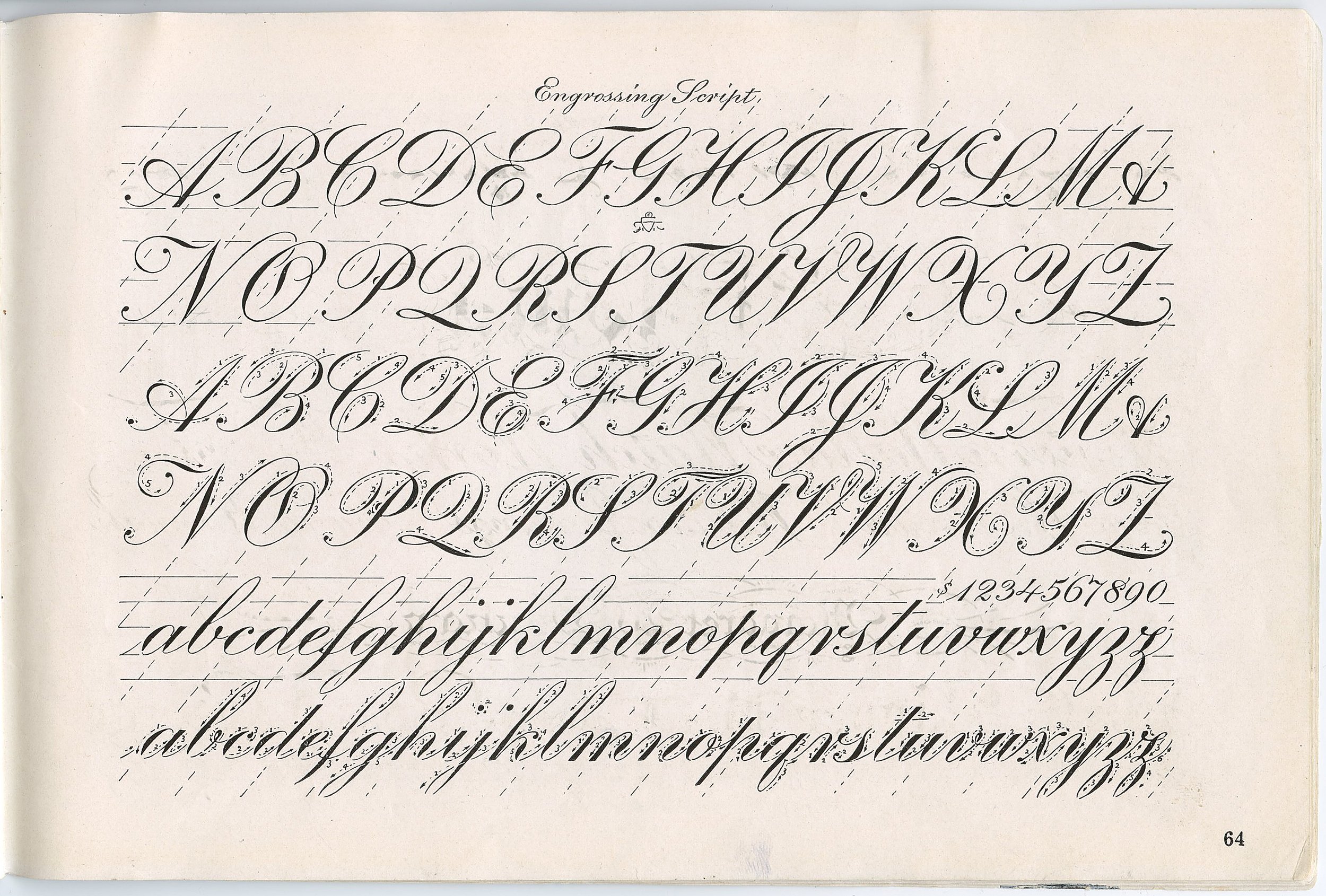
Speedball Textbook 12th edition, p.64 with Ross F. George’s “Engrossing Script” exemplar
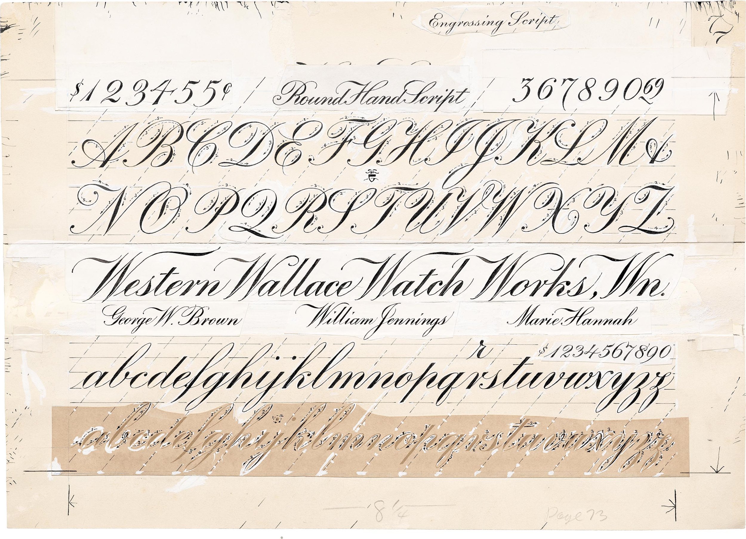
It’s impossible to tell from the printed textbook how it was initially written. Fortunately for me and all the other calligraphiles out here, George’s family donated an archive of his work to the Lettering Archive. That collection just happens to include an original pasteup of the alphabet in question.
The pasteup is large, marked as 24”x33” according to the LA records. Interestingly, it includes both the Engrossing Script exemplar from page 64 of the 12th edition, and the Engrossing/Round Hand Script diploma text from page 63. The “Engrossing Script” title for the exemplar has been replaced with “Round Hand Script” but you can see the “Engrossing Script” text pasted top right of the page, perhaps an indication that it was being considered for inclusion in whichever printing this pasteup was for?

© The George Family. This image is care of the Letterform Archive. I’ve included it exclusively for educational purposes in reference to the question of how this exemplar was created, and the instructions to use C-6 nibs for Engrossing and Round Hand scripts
At this scale, it’s unlikely that any of the lettering was traditionally ‘written’. It’s all heavily retouched for print. The resolution on the image is great, but I can’t tell for sure whether the main alphabet elements are an enlarged print with inked corrections, or fully drawn and painted. Either way, there is no indication of what type of pen may have been recommended in connection with the page. This was the real beginning of my spiral. I’ll spare you the play-by-play and skip to everything I’ve found.
Spoiler: No, Ross George did not write copperplate (aka Round Hand, aka Engrossing Script) with a broad-edge nib (either in an oblique or a straight holder). However, the Speedball Textbook did advise its readers to use a C-6 Speedball nib for the script for 10 editions published over a span of 50 years.
In one of those funny coincidences that sometimes lead me to wonder about the nature of the universe, this advice coincided exactly with the two older editions of the textbook in my possession. It began in the 12th in 1935, and ended with the 22nd in 1991, when all of Ross’s Round Hand samples were finally phased out and replaced by more contemporary copperplate work.
To understand what happened, we need to go back to the 10th edition. Here you can see the Round Hand Script Alphabet, and a footnote stating it was penned with a Hunt 101 Imperial nib. This is exactly what you would expect. Hunt 101s are fine point, highly flexible nibs that are perfect for producing the heavy shaded strokes and fine hairlines that characterize the script. They’re still produced today and are great for copperplate, ornamental and modern pointed pen styles.
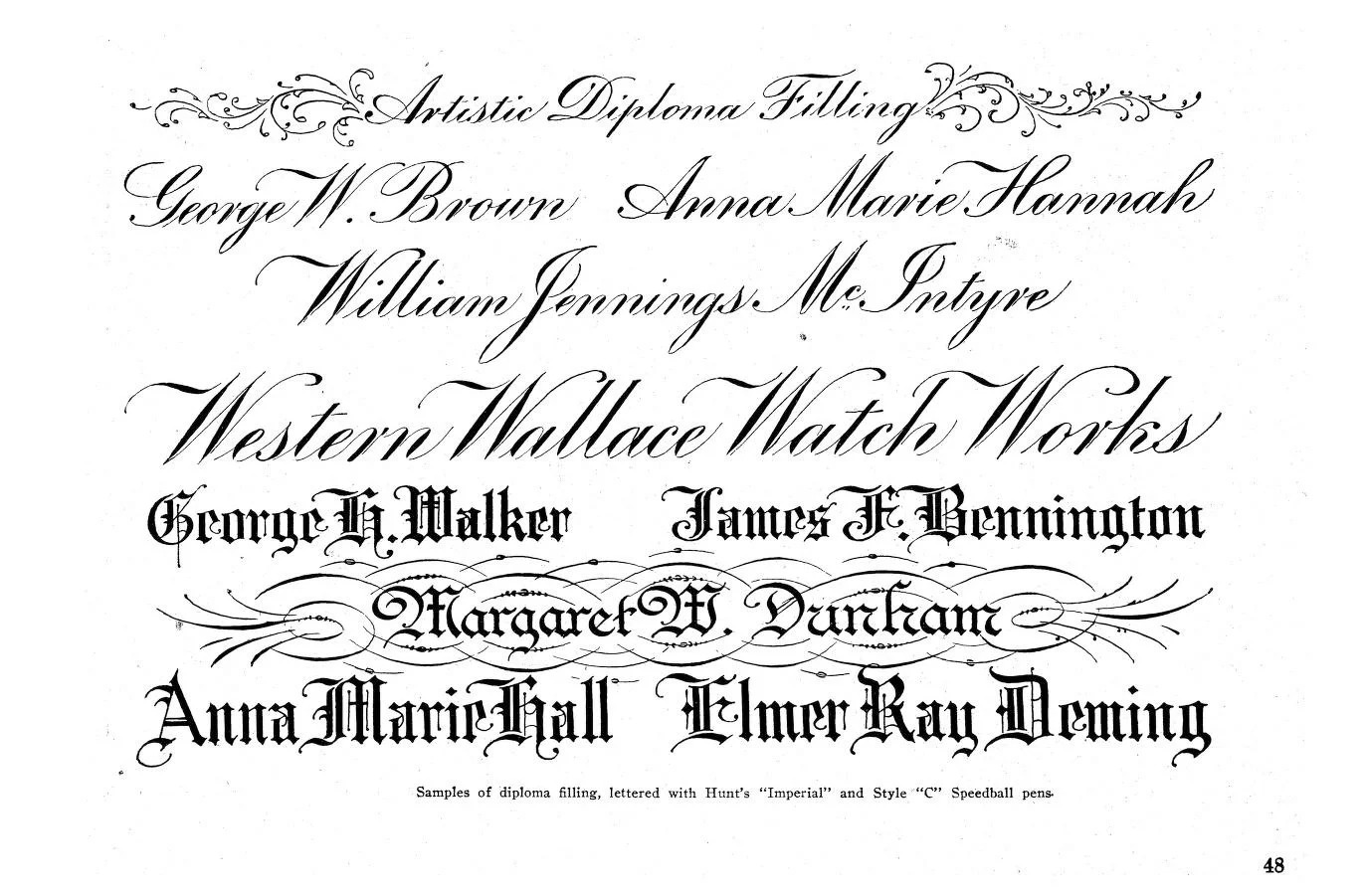
Speedball Textbook 10th edition (1927) p.48 with Ross F. George’s diploma samples. This image is care of The Internet Archive
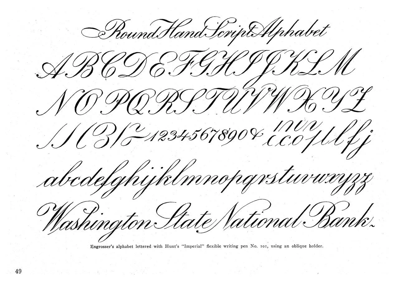
Speedball Textbook 10th edition (1927) p.49 with Ross F. George’s Round Hand Script Alphabet. This image is care of The Internet Archive
On the preceding page, you can see the aforementioned samples for diploma text, and a footnote stating the various styles were lettered with the same Hunt 101 Imperial nib as well as Speedball C style nibs. Again, exactly as expected. Hunt produced both nib styles, the 101 would have been used for the Round hand script, and the C nibs used for the broad-edge scripts.
The 11th edition is similar. A resolution for the Alaska Steamship Company is labeled as written with a c nib and a Hunt 101. The text on the diploma page and the Exemplar page has changed though. Both now say the round hand script was written with a flexible engrossing pen instead of specifying a Hunt 101.
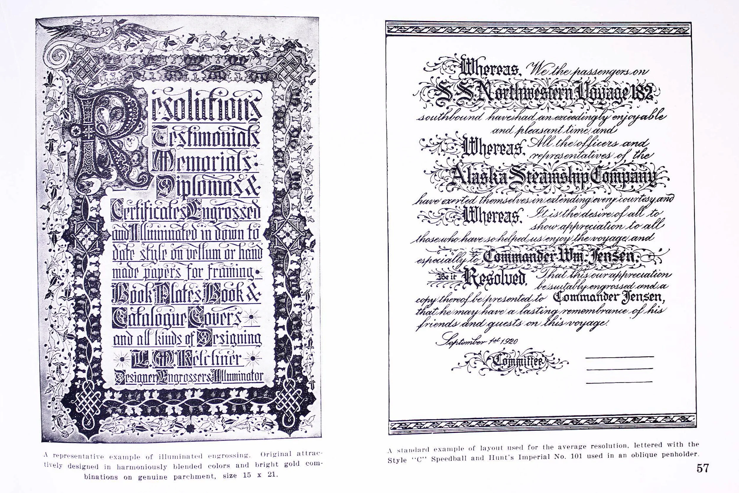
Speedball Textbook 11th edition (1929) p.57 with a resolution for the Alaska Steamboat Company on the right, and a footer stating it was penned with a C nib and a Hunt 101 in an oblique holder. This image is care of Luc Devroye
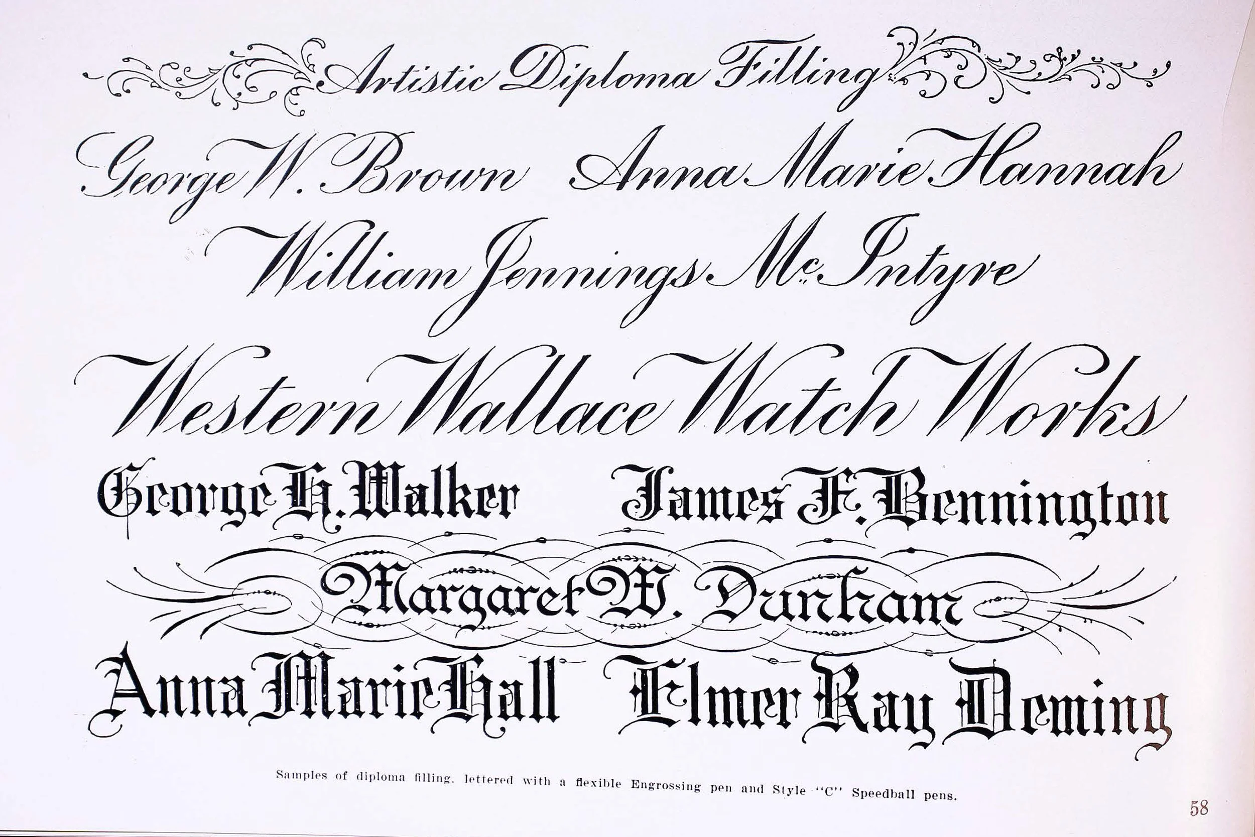
Speedball Textbook 11th edition (1929) p.58 with George’s diploma samples plus the footer stating it was penned with a flexible Engrossing pen and C nib. This image is care of Luc Devroye
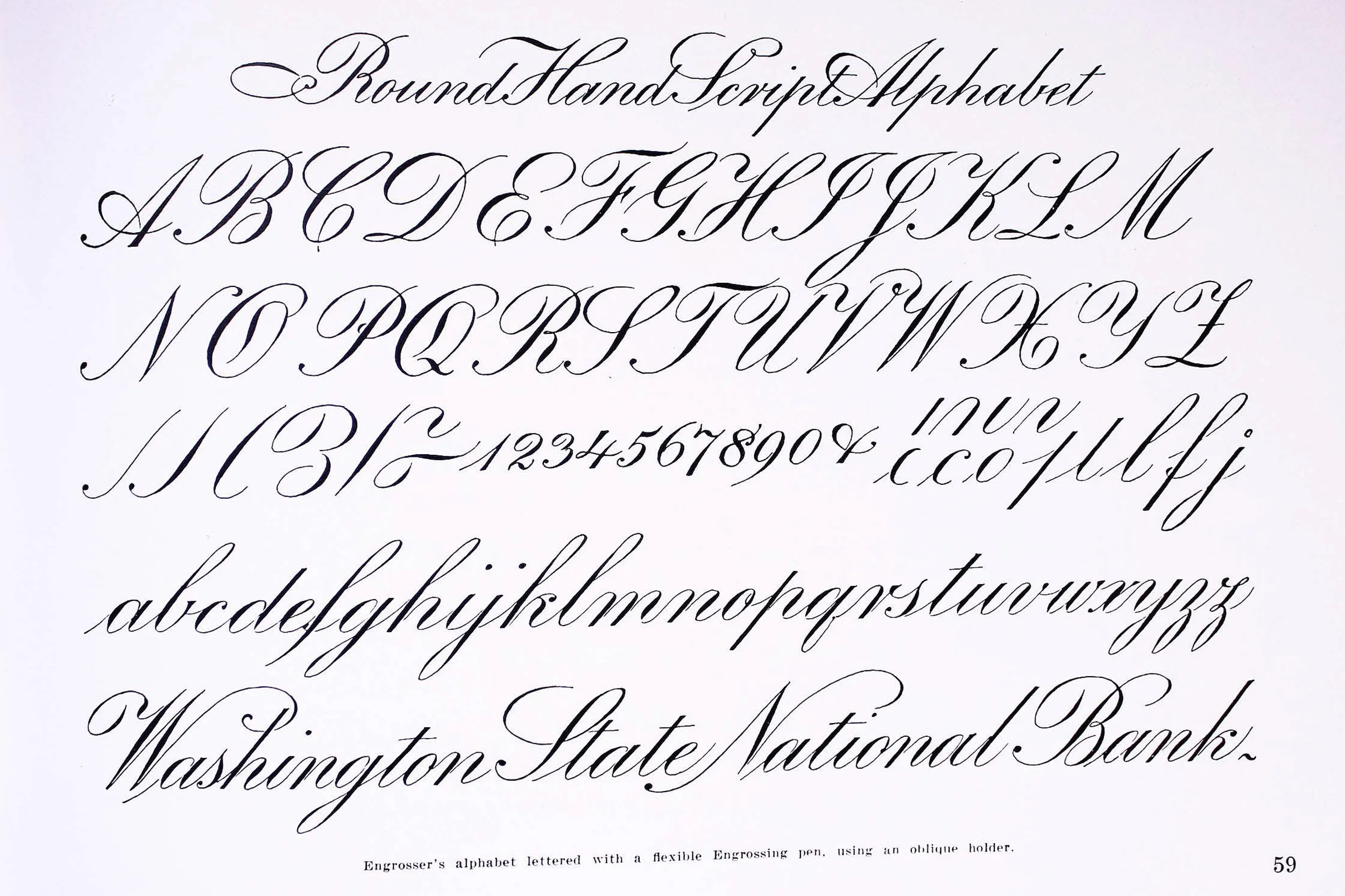
Speedball Textbook 11th edition (1929) p.59 with the full Round Hand Script Exemplar plus the footer stating it was penned with a flexible Engrossing pen using an oblique holder. This image is care of Luc Devroye
The 12th edition comes out, and all mention of the flexible engrossing pen or the Hunt 101 has been dropped. The Alaska Steamship resolution now says C-6, and the footnote on the diploma page now says C-6 for the full exemplar (see photos above).
I can only speculate on what happened with the descriptor text between the 11th and 12th editions. It seems unlikely to me that there was an intentional elimination of the Hunt 101 name. It’s not like the 101 was made by a competitor. My best guess is a simple copy edit error. Someone didn’t know the nuances of the script and thought there wasn’t a meaningful distinction between a “flexible Engrossing pen” and a C nib. Or maybe someone thought the “flexible Engrossing pen” was what was used for the broad-edge engrossing scripts, and the C nib was for the Round Hand Script. Either way, once that mistake made its way into the text, no one ever caught it to correct for future editions.
I believe the pasteup in the Letterform Archive is for the 13th edition. The final printed version has the new “Round Hand Script” title on the page as well as the Western Watch Works text that was formerly part of the diploma text page. At the bottom, in no uncertain terms, it says “Use a C-6 Speedball in an oblique holder for this style.” C-6 is now also listed for the script on an Evolution of Letter Styles page. This cements it. The instruction to use a C-6 in an oblique is carried forward through every future edition I could find. It’s called out with the exemplar, the evolution of lettering styles example, and every sample resolution where a nib is marked.
© The George Family. This image is care of the Letterform Archive. I’ve included it exclusively for educational purposes in reference to the question of how this exemplar was created, and the instructions to use C-6 nibs for Engrossing and Round Hand scripts
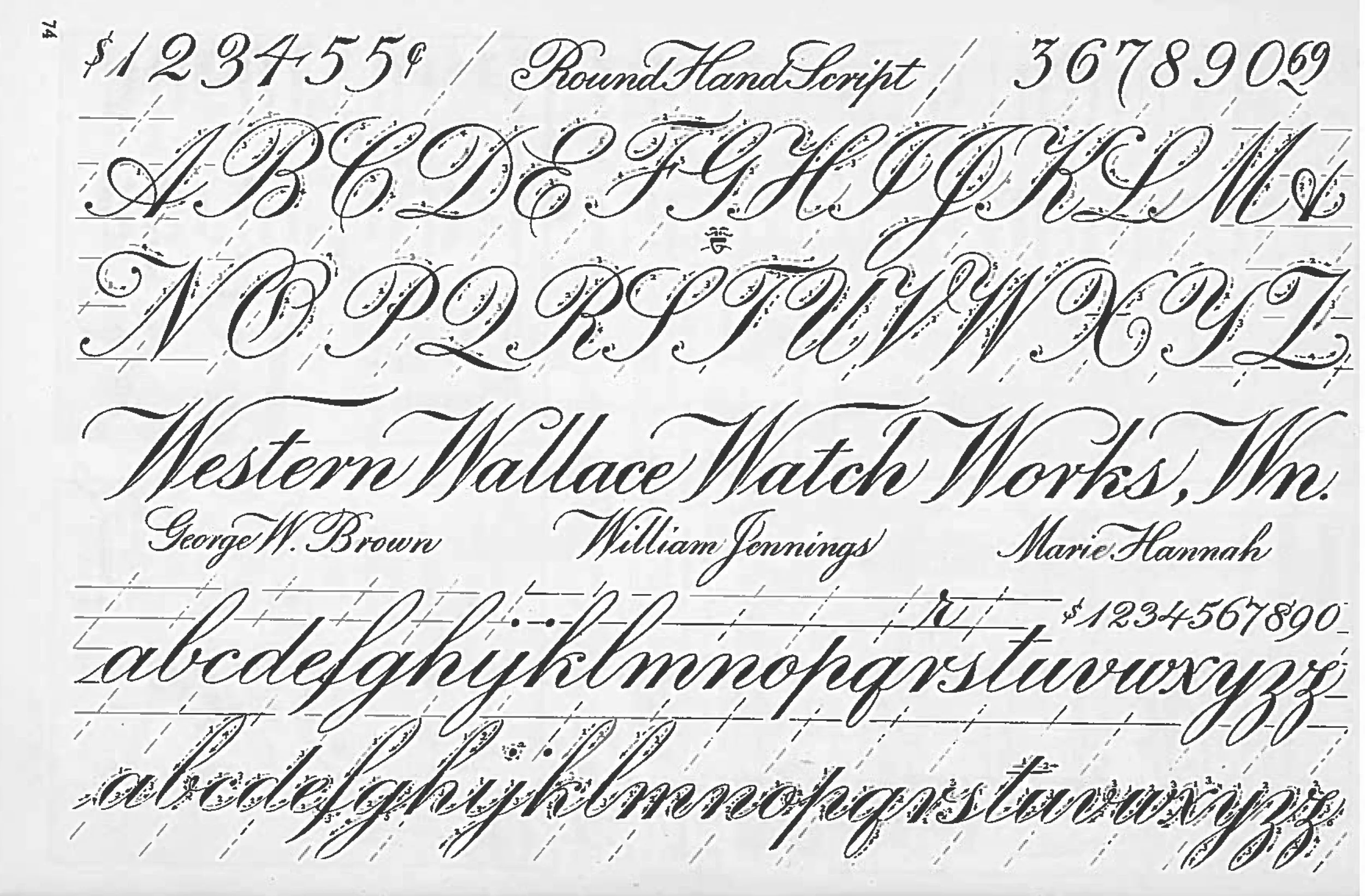
Speedball Textbook 11th edition (1937) p.74 with the full Exemplar page and the version of the “Round Hand Script” title from the Letterform Archive paste-up that wasn’t present in prior editions. This image is care of visible.org.
Immersing myself in the evolution of this Round Hand Script exemplar has been a nice reintroduction to Ross’s pointed pen work. I don’t think I ever studied it as closely as the work of many of his contemporaries.
I decided to give his exemplar a shot with a C-6 for the fun of it, and quickly confirmed there’s just no way to do it. With a lot of manipulation of the nib and rotating the pen angle, I was able to get decent hairlines and approximate the correct locations of the shaded strokes. The real hurdle was the flexibility. C nibs aren’t as stiff as a Brause, but they don’t have a lot of give to them. There’s no way to open the tines of a C-6 enough to obtain a thick enough line weight for anything larger than maybe a 2 or 3mm x-height script. The x-height of my little test here is around 4mm and you can see how thin the shades are on the top line penned with a C-6 using an oblique holder compared to the line beneath written with a Hunt 101.
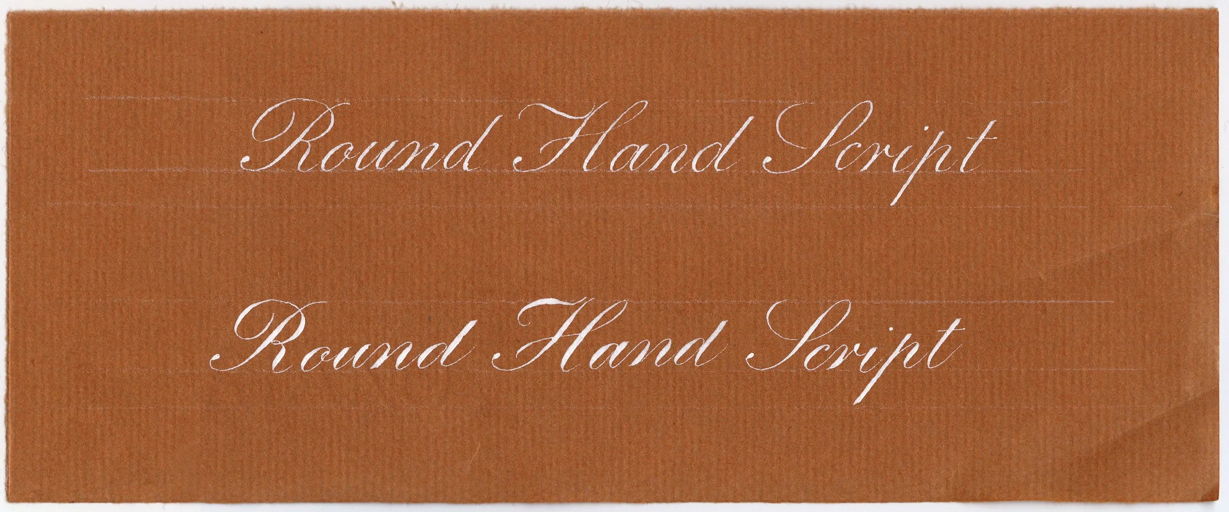
My attempted reproduction of the Speedball Textbook 13th edition Round Hand Script Exemplar Title with a C-6 nib (top line), vs a Hunt 101 (second line). The x-height for both lines is roughly 4mm, and I used Dr. Ph. Martin’s Bleedproof White on Fabriano Ingres paper.
I accepted defeat, and switched to a Hunt 101 and attempted a recreation of the full exemplar as close to the original as I could make it. This full page is Dr. Ph. Martin’s Bleedproof white on Fabriano Ingres paper with a Hunt 101 Imperial (used in an oblique holder). The caps are about ¾” high and the x-height on the large line of lower case letters is about ¼”.
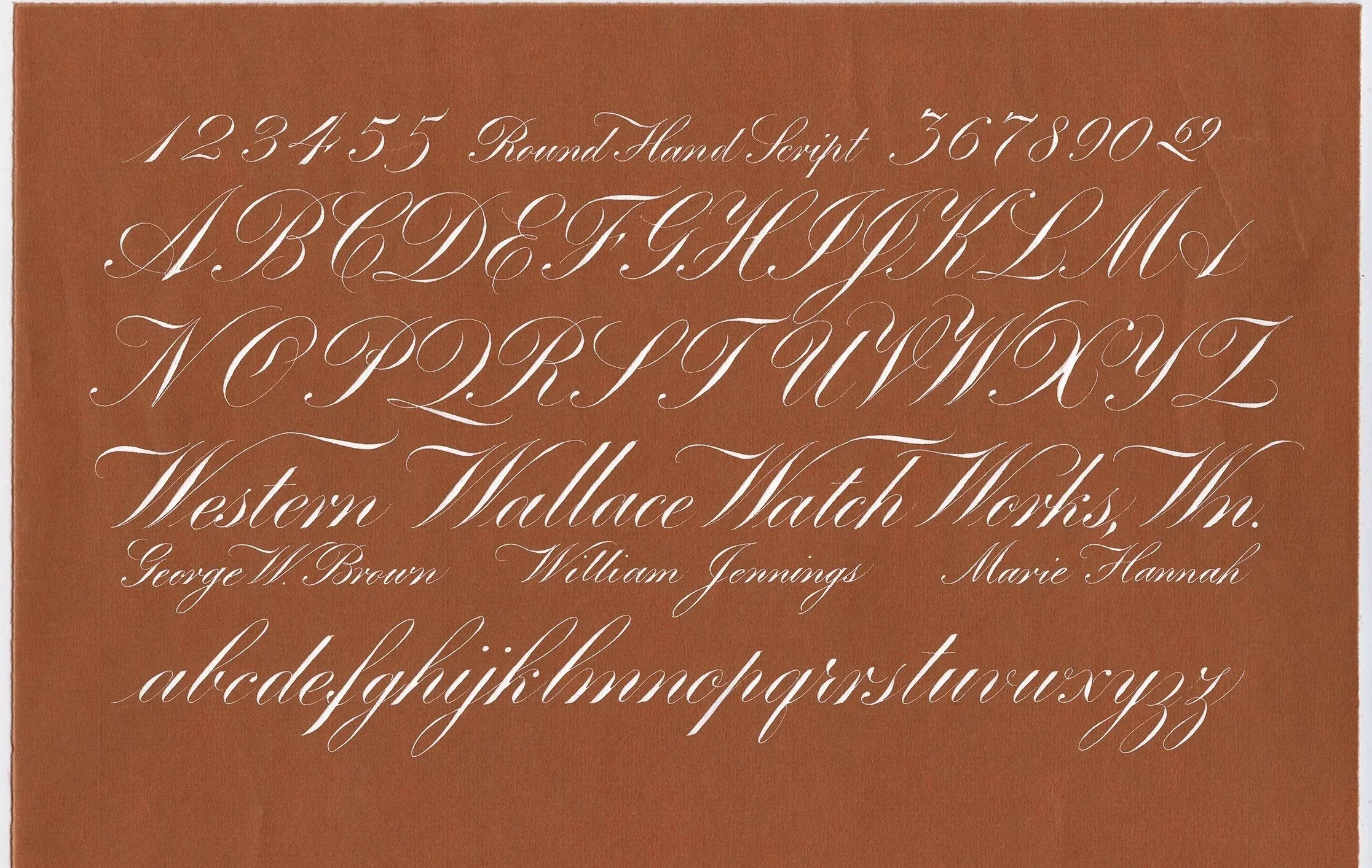
My full page reproduction of the Speedball Textbook 13th edition Round Hand Script Exemplar page using a Hunt 101 in an oblique holder, and Dr. Ph. Martin’s Bleedproof White on Fabriano Ingres paper. The capital letters are about ¾” high and the x-height on the large line of lower case letters is about ¼”.
The shaded crossbars and swashed horizontal strokes are always a challenge with an oblique holder, but finding the rhythm of pressure and release as I worked my way through brought me back to what I love about this script. I’ve been super focused on lightweight scripts (mostly Italian Hand) for quite a while—I’m feeling inspired to get back into some more shaded writing.
Next Up…
As usual, I haven’t made a final decision yet on my focus for the next issue, but I am leaning towards something either in the English roundhand world, or maybe some later shaded ornamental penmanship work. I’m tempted to try out the between the fingers grip with a straight holder to line it up with the script slant. Could be fun? Or a lovely disaster?
If there’s something you’re interested in or would like to learn more about, please let me know. Requests and suggestions are always welcome and appreciated :)
Thanks for studying along with me!