Anonymous 17th Century French Calligraphy Manuscript
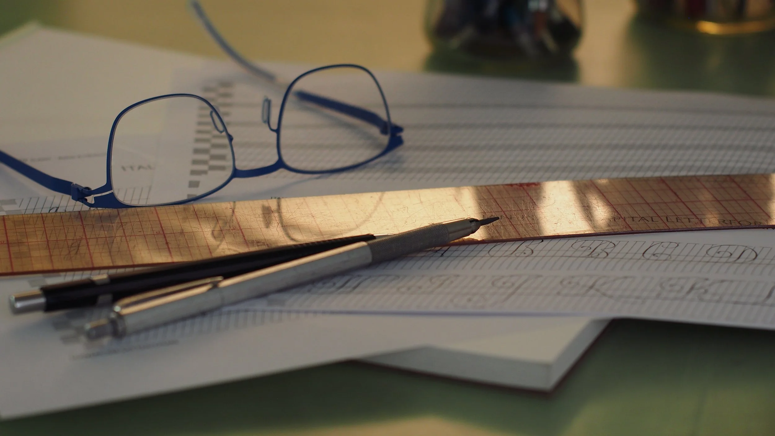
Detail of a little of my practice from this month—read on to see the full piece :)
Hello friends
Welcome to the April issue of Books with Hook.
If this is your first time here, Books with Hook is a monthly study blog focused on historical calligraphic works, manuscripts, and related printed materials.
You can find past posts here: https://www.lindsey-hook.com/books-with-hook/
If you’d like to follow along for future posts, please join my mailing list.
French Anonyme
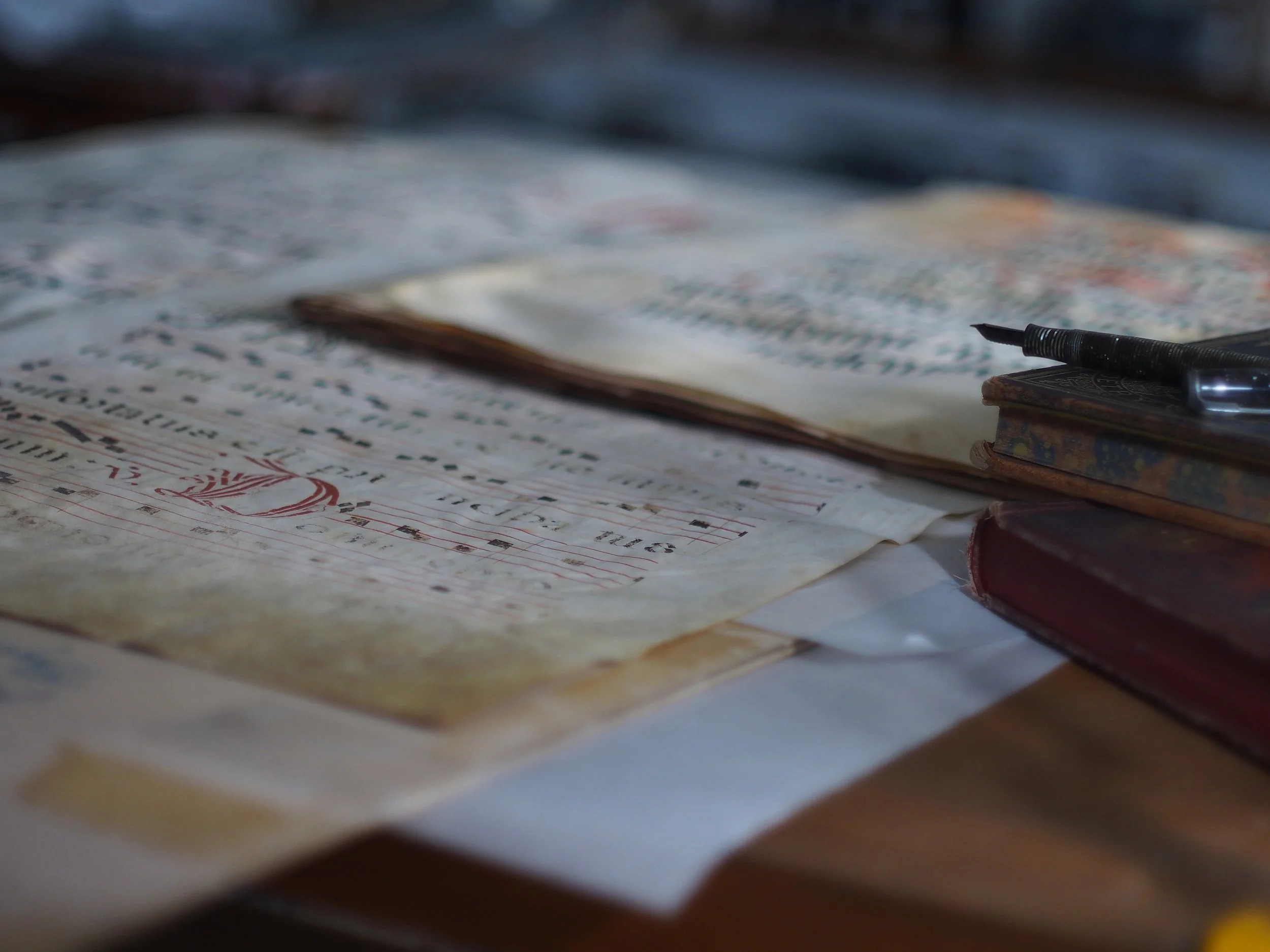
The Newberry really is a treasure trove—I spent most of my April study time digging into a lovely little manuscript in the library’s collection. The scribe is unknown, but the book is believed to be French and produced around 1600. You can view the full text in the Newberry Digital Collections here: https://collections.newberry.org/asset-management/2KXJ8ZSWEBZI6
The book is roughly 6” x 11”, and is composed of 34 handwritten pages. There are no exemplars included, or ductus guides, but it’s a copybook-style survey where each page demonstrates a finished block of text in a given script style. The majority of the scripts included fall somewhere under the general humanist to Italian chancery (cancellaresca corsiva) umbrellas.
The first page jumps right in with a relatively light-weight humanist minuscule style for Latin text. The letterforms are fairly open and broad, vertical, and serifed. The shoulder strokes branch from just below the x-height, as opposed to rising from the base. Except for the æ ligature, the script is devoid of any decorative flourishing or connectivity between the letters. One little quirk caught my eye that I haven’t noticed elsewhere; there are little hatch marks included on the left side of the stems of the lowercase l’s and the long s’s. This is something I think of in connection with earlier gothic-style scripts, and it seems curious to me in this context, although I do believe it’s common for it to be included on the long s.
Image © Newberry Library
A couple pages later the script flips, and the lettering has moved from Roman to Italian. Many of the underlying letterforms are similar, but the proportions are different—the letters are narrower, certain ascenders and descenders extend further into the interlinear space, and a noticeable slant is present. The line weight is thinner, but the script is definitely still edged with clear thicks and thins, indicating the quill is likely held at a roughly 45° angle. Most letters are separate, but the serifs are angled to flow easily from one letter to the next, and there are a number of direct ligatures. I really love the long to short ſs ligature, and the g’s.
Image © Newberry Library
A couple leaves later, and we have the first page with a title—Italique—and a text block of a delicate style of cancellaresca corsiva/Italian chancery hand. The script is fully cursive here, with each letter connecting from one to the next in fluid strokes. The linework is hairline fine, and nearly monoline except for little bits of carefully placed weight, and the blobbed and swashed ascenders and descenders. The letters are incredibly narrow, almost 3:1 h:w to my eye, but the spacing is airy with more than a letter's width of open paper between most characters. I’ve mentioned this before, but this open quality is one of my favorite aspects of the script. All the fancy loops and heavy clubbed ascenders are kept in the interlinear spaces, leaving the core of the writing very legible (assuming you know the letterforms).
Image © Newberry Library
If you’ve been following along with these study blogs, you may know that I’m interested in how this script was accomplished with a quill, especially since our contemporary Italian hand takes on it are almost exclusively done with metal, pointed pen nibs.
Robert Williams (a fellow calligrapher, scholar, and one of the founding members of my local guild, the Chicago Calligraphy Collective) was kind enough to chat with me quite a bit throughout the month and share some of his knowledge on this topic. He sent me several translations from two of Ludovico Curione’s copybooks about how to cut a quill for this style of cancellaresca, and how to form the characteristic blobbed ascenders (testeggiata). I want to dedicate a study blog to Curione and become more familiar with his work, so I’m not going to go too far down that rabbit hole today, but to summarize, Curione recommends using an oblique cut quill with a bevel scooped out of the top. This makes sense to me. The bevel thins the edge of the quill, allowing for sharp, fine lines. The oblique cut makes it easier to slightly rock the edge of the quill up so it isn’t fully in contact with the paper while writing, again, allowing for a thinner line.
I’ve written Italian hand with a point-cut quill before (if you’re interested, you can watch a real-time recording on my YouTube channel here: https://youtu.be/wk8Gya8PVBY), but I’ve always had to do a certain amount of retouching to add in all the little weighted accents, or change up my grip to throw the ascender strokes. I was curious to try it with an edged quill, so I trimmed one down according to Curione’s instructions, and was pleasantly surprised at how natural it felt for the script. The rough surface of the scrap cold-press watercolor paper I used was a bit of a challenge, but all of the slight variations in line weight were fairly easily achieved through small bits of rotation, and lifting the back edge of the quill slightly up from the page. I had the best results holding the edge of the quill at nearly the same angle as the slant of the script, so all those fine lines are written with the edge of the quill moving sideways up and down the page. This first shot at it is admittedly a bit ragged, but I really enjoyed it and plan to work at it more.
A first shot at Italian hand with an edged oblique cut quill using some old watercolor for ink.
Robert was also kind enough to share that he knew of another manuscript copybook by an unknown French scribe in the collection of the Met, which is a very close match to the one in the Newberry collection. Fortunately, this book has also been digitized, so those of us outside of New York can see it too: https://www.metmuseum.org/art/collection/search/435399. The two books are such close copies that I think they must be written by the same scribe. Several pages are nearly identical duplicates, and I recognize some of the same texts. Notably, the book in the Met collection includes an exemplar page for all the characters of the “Italique” script.
Image © The Metropolitan Museum
Whoever the scribe may be, their books are quite remarkable. I love that they’re manuscripts and retain the direct evidence of how they were written.
The pages lack the intricately ornate borders popular in engraved copybooks of the period, which I believe is typical for manuscript copybooks. However, many of the lettering examples themselves are highly decorative. Gold ink accents add bits of sparkle that are hard to capture through lenses and screens.
There are several fun pages with micrography designs sprinkled in amongst the more standard-looking text blocks, including a maze, a few spirals, plus a couple other geometric forms and text knots. It’s hard to comprehend just how tiny this writing is without seeing it in person. I didn’t bring a ruler with me when I checked out the Newberry book, but I’d guess the line height is 1mm, maybe less. It’s amazing how legible the letterforms remain.
Tiny tiny micrography calligraphy maze with gold ink
Detail of micrography maze with gold ink
There are also a number of examples of different kinds of split, or stitched lettering. I love the slow pacing of calligraphy, but I think these might take it a bit too far for me. They’re fun as accent or display text styles though—I could see myself incorporating something similar for title lines, or headers within a larger text block.
Image © Newberry Library
Image © Newberry Library
Image © Newberry Library
Image © Newberry Library
At the end of the Newberry book are several pages dedicated to what I believe is a German or Dutch Secretary hand or kurrentschrift. I’ve been studying this general style a bit as well, but this blog post is already fairly long, so I’ll leave any more in-depth discussion of it for another day.
Image © Newberry Library
Lastly, hiding out around three quarters of the way through the book, is this delightful little polka dot variant.
Image © Newberry Library
It looked like so much fun, I had to try it myself. I suspect my copy is slightly larger—the border around mine is 4.5” x 9”. It took me a little bit to get the slant steady, and matching the rhythm and spacing without planning ahead was a bit hit or miss, but I really enjoyed this. I can imagine so many possibilities for the dots.
Copy of one of the text blocks in the Newberry’s French copybook, written with a metal pointed pen nib and the old style of the Boku-Undo Saiboku stick ink. The color is labeled as “whitish green”—I have no idea what the actual pigment is, but it reminds me a lot of cobalt green.
Next Up…
As usual, I have more topics than time, and I haven’t picked what to focus on in May. If there’s something you’re interested in or would like to learn more about, please let me know. Requests and suggestions are always welcome and appreciated :)
Thanks for studying along with me!