ABC's with Felix Van Sambix and a Dutch Mystery
Detail from Paul Dijstelberge’s photo of a dedication page in one of Felix Van Sambix’s manuscript albums (https://flic.kr/p/2kKhz92)
Hello friends
Welcome to the March issue of Books with Hook—I hope you’ve had an invigorating month. I love this time of year when the air is still crisp most days and all the little buds and spikes of new growth begin to poke out from the ground and the trees. It always feels like a good time to push boundaries and start new things.
If this is your first time here, Books with Hook is a monthly study blog focused on historical calligraphic work, manuscripts, and related printed materials. You can find past posts here: https://www.lindsey-hook.com/books-with-hook/
If you’d like to follow along for future posts, please join my mailing list.
All the Alphabets of Felix Van Sambix
I came across the work of Felix Van Sambix a number of years ago on The World of the Free Mind’s Flickr account. I was too busy to inspect the photos at the time, but from a quick glance, the work appeared to be handwritten or potentially a combination of handwritten and printed text. I wondered if the manuscript pages were layout plans for engraved plates intended for printed copybooks and have been curious about them ever since.
The World of the Free Mind Flickr account is managed by Paul Dijstelberge. To my understanding, it’s a digital archive of books and manuscripts in the collections of The Embassy of the Free Mind, a museum and library located in Amsterdam. The Flickr account is a wonderful black hole to fall into, full of excellent quality high-resolution photos of printed and handwritten materials going back centuries.
Portrait of Felix van Sambix printed/engraved by Willem Jacobsz based on a painting by Michiel Jansz van Mierevelt (© Paul Dijstelberge https://flic.kr/p/2kKmhBj)
Dijstelberge’s photo album of Sambix's work features pages bound in three separate manuscripts or albums. Unless otherwise noted, all photos I’ve included here come from these albums and are copyright Paul Dijstelberge. I’ve used the photos under the Creative Commons Non-Commercial License. Aside from cropping some of the images to focus on certain parts of the text, I have not edited them in any way.
The Library of the University of Strasbourg also has a manuscript of Sambix’s work available through the BnF Gallica digital collection, but the pages aren’t as clear, so I focused my time on the WOTFM images.
A bit of history for context: Sambix was a respected 16th to 17th-century Dutch writing master from Antwerp and later Delft. He likely worked with Jan Van De Velde as a student, who in turn likely worked with Maria Strick as a student—two of my other favorite Dutch calligraphers from this period. Sambix was born in 1553 and died in 1642, living to a ripe age of 89 by my calculations.
Interestingly, most of his surviving work that I’ve found is actual writing, as opposed to engraved prints. More often than not, I find the reverse to be the case. This makes him of particular interest to me for insight into how accurate the engraved depictions of other calligraphers' work from the period may or may not be. It also makes me wonder about Sambix’s intentions for these pages. Were they actually plans for fully printed copybooks? The more digging I do, the more I suspect multiple intentions and uses may have been at play.
Clearly the pages were meant to be parts of alphabet books (aka capital letter books)—a common style of writing manual composed of pages featuring decorative or large capitals for all the letters of the alphabet, along with contextual writing samples. This is supported by the inclusion of a title page stating as much in the most complete of the three WOTFM albums, plus the fact that almost all of the pages combine printed ornamental capitals with handwritten text.
Fully engraved title page I believe for Sambix’s alphabet book, Nieuwen ABC… © Paul Dijstelberge https://flic.kr/p/2kKmNHn
Partially engraved page © Paul Dijstelberge https://flic.kr/p/2kKmNur
It seems logical that Sambix would have a set of existing plates with ornamental capitals which he could print onto pages and then design additional text around. Furthermore, there are records that he did publish at least three writing manuals. In fact, I believe the aforementioned title page is a plate from his printed book Nieuwen ABC…, published in Rotterdam in 1609. However, the dedications in the manuscript albums make me wonder if these half-written/half-printed pages were something a bit different.
One of the books is for Sambix’s brother-in-law, Jean Coutereels. Another is for his student, Pieter Conrad/Pierre Conrat. The manuscript in the BnF Strasbourg collection is for Jean Van De Bosch. These dedications lead me to believe that these books, in the forms they are bound, are fairly close to the intended final output. Sambix likely printed pages with the capitals in place—sometimes also using decorative borders—and then used those pages as open templates to be completed with handwritten exemplar texts. These one-of-a-kind pages were then compiled—possibly including fully engraved pages from his print books—and sent to friends, peers, students, etc., as unique albums for each person. This is purely speculation, and perhaps the history around these specimens is already known. If you’re familiar with any of the specifics here, please leave a comment. I’d love to know more.
On to the calligraphy!
Sambix covers a wide range of scripts: gothic styles including fraktur, and a number of what look to me like Dutch secretary, gothic cursive, and civilité style scripts, humanist/Romanesque miniscules and capitals, as well as several Italianne variants including antiqua, moderne and some lovely, delicate examples of the more flourished Italian cancelaresca popular in Dutch work of the period.
© Paul Dijstelberge https://flic.kr/p/2kKmhER
© Paul Dijstelberge https://flic.kr/p/2kKmhFc
© Paul Dijstelberge https://flic.kr/p/2kKmNLd
© Paul Dijstelberge https://flic.kr/p/2kKmNsN
When I first started digging through these kinds of materials, I was mainly looking for origins of the modern pointed pen Italian hand and copperplate styles, but the more I see, the more I find myself checking out the details of the various broadedge scripts.
© Paul Dijstelberge https://flic.kr/p/2kKmNqo
I love this page with the slightly lightweight style of fraktur for the display text. The letters are sharp and appear to be written with minimal retouching aside from the flourishes added to the capitals and the lower case s’s. It feels graceful and a bit airy in comparison to other, denser frakturs.
Detail of the full page image above © Paul Dijstelberge https://flic.kr/p/2kKmNqo
What I’m really drawn to here is the main body text. I don’t know the specifics of these styles well enough to identify exactly what the script is, but I like it as a nice, legible bookhand.
The core letter form is squat, with most of the lowercase letters almost as wide as they are tall. The line weight is fairly light, done with a finely cut quill. This combination leaves much of the paper exposed in the counters and negative space around the letters and it makes for easy, pleasant reading. There’s minimal interlinear space—about three times the x-height of the script to my eye—and the standard ascenders and descenders adhere pretty closely to a 1:1:1 ratio. There’s some variation in capital height, but most seem about two and a half times the x-height, taking up half the interlinear space.
I love the tension between the round, open forms, the crisp acute angles in certain letters, and the hairline dagger descenders that cut down through multiple lines. I would really like to explore this script more and develop my own take for a bookhand.
There are lots of commonalities with French ronde—I think these scripts are closely related and were developed/in use during the same time period. There are, of course, lots of little differences. The shoulders of the h’s, m’s, n’s, and p’s branch from around a quarter to a third of the way down the preceding stem stroke in Sambix’s script, as opposed to branching from the base, as seen in my version of French ronde (below). The tops of the rounded forms (like the a’s, c’s and e’s) are angled. The ascender of the d juts back as a straight line, not a spiral curling into itself. The b and the p both have closed bowls. So many differences, but the scripts still have a similar character. They both look lovely in text blocks.
Detail of my French ronde script, written in gouache on watercolor paper with a metal nib
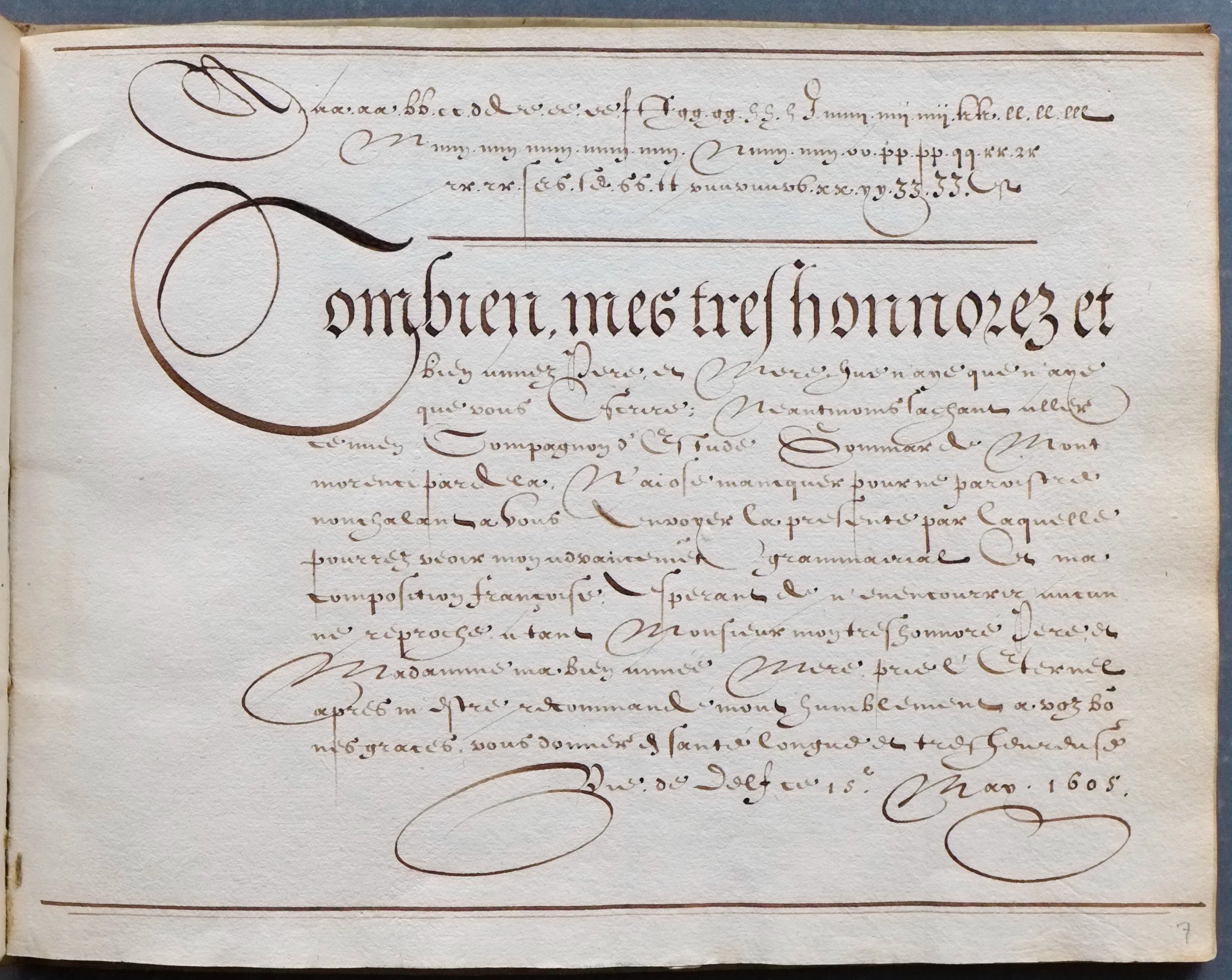
Page 16 of the WOTFM manuscript for Pieter Conrad is a wonderful display of a Dutch/Flemish style of Italian cancelaresca. The oval border is used on multiple pages and I assume is drawn using a template of some sort, but the lettering all appears to be hand done—although probably more drawn as opposed to written in the case of the large capital M. You can see the ink is darker where it’s pooled at the end of a stroke, or where lines have crossed. I assume a lot of planning went into the page layout—this wasn’t done on the fly—and there’s a significant amount of retouching in all the little blobs, but the lettering itself is fairly clean. The lines are probably not quite as delicate as an engraving, but the consistency of the letterforms and the smooth, graceful transitions through the stem strokes and all the loops and swashes is all there. Writing like this is why I believe engraved examples may be fairly close to the scribe’s original work in many cases.
Page 16 of the WOTFM manuscript for Pieter Conrad © Paul Dijstelberge https://flic.kr/p/2kKhzjn
Sambix’s hand here is a little denser than much of the work of his contemporaries. I’m used to seeing a full letter width between each letterform in this script, but Sambix’s spacing is notably tighter. The lowercase letters are tall and narrow, almost 2:1 height:width, and they are nearly monoline except for the capitals and the various swashed and blobbed strokes. Close inspection reveals that even the small letters are written with a quill with at least a bit of an edge, probably held at around 45°. All of this is very typical of the script.
Detail of page 16 of the WOTFM manuscript for Pieter Conrad © Paul Dijstelberge https://flic.kr/p/2kKhzjn
What’s less common is his lowercase k in the alphabet at the top of the page. Lowercase k’s are often not included in these alphabets, and this one feels out of character. If I saw it without the context of the other letters around it, I probably would have guessed it was an h or lr. It’s a pretty letter, I’m just not convinced I could ever use it.
Sambix’s addition of a flourished ascender stroke to some of his lowercase s’s is more successful and adds some fun unique character.
The capitals at the bottom of the page are a little hit-or-miss for me as well. The capital K is much more successful than the lowercase letterform, and it fits well with the rest of the script. The capital L is new to me and a nice variant to have on hand. The V feels much too wide, though, and the axis of the X too high.
Detail of page 16 of the WOTFM manuscript for Pieter Conrad © Paul Dijstelberge https://flic.kr/p/2kKhzjn
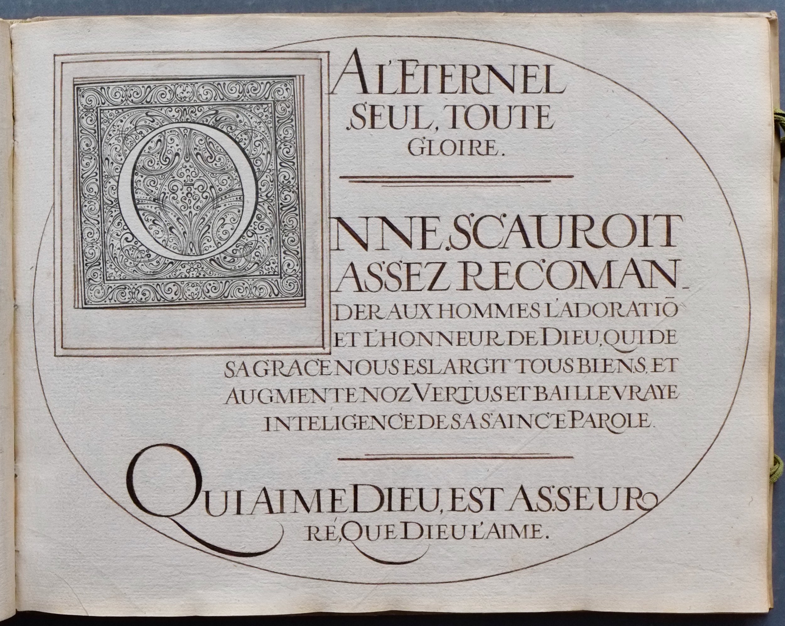
The seventh page in the WOTFM album without a dedication to a specific recipient caught my eye for a few reasons. I’m not convinced it’s hand-written calligraphy. The color of the ink is uniform and dark. I see no evidence of quill marks. I’m pretty confident this is a fully engraved page. It also reminded me of the work of Jan Van De Velde, so I popped over to the Rijksmuseum’s digital archives to see if I could find a good sample of Van De Velde’s work to compare it with. To my surprise, I quickly discovered a nearly identical plate from his Spieghel der schrijfkonste in their collection. I overlayed the images to see just how close they are. They’re different enough to say that they’re not printed from the same plate but similar enough to see that they’re very near copies.
I believe this is a fully engraved copy of Jan Van De Velde’s work, © Paul Dijstelberge https://flic.kr/p/2kKmP1b
Overlay image I created using Paul Dijstelberge’s photo of Sambix’s copy and the Rijksmuseum’s image of Van De Velde’s design.
A page from one of Jan Van De Velde’s writing manuals in the Rijksmuseum’s collection https://id.rijksmuseum.nl/200618982
A little poking around quickly revealed at least two more near duplicates.
© Paul Dijstelberge https://flic.kr/p/2kKmhWH
© Paul Dijstelberge https://flic.kr/p/2kKmhYw
So, what’s going on here? All of the Van De Velde plates include his name. They were likely engraved by Simon Frisius and published in 1605. Sambix’s plates appear to be from 1616. He certainly would have had a copy of Van De Velde’s book, but he was also senior to Van De Velde. I’ve read that he tutored Van De Velde on some level, and Sambix beat Van De Velde and won the Prize for the Crowned Pen competition in Rotterdam in 1590. Why would he have copied the work? It’s hard to say what’s actually happening. The Sambix plates are clearly copies of Van De Velde’s work, but was Sambix copying them and passing them off as his own? Or were the copies included simply as additional instructional materials in these one-of-a-kind albums for students?
Detail of a letter from Jan Van De Velde to Jacob Matham https://id.rijksmuseum.nl/200686223
Regardless of the exact details of the situation, comparing the plates is interesting. In all cases, I prefer Van De Velde’s work. The engraving is a little more delicate, the curves a bit smoother, and I find the letterforms a bit more appealing—slightly more open. Simon Frisius was an excellent engraver, but examples of Van De Velde’s actual writing lead me to believe the calligraphic sources for the prints would have been of equally high quality.
The Sambix plates feel a bit heavier. The work is also of excellent quality, but it’s undeniable that there are more wobbles in the flourishes and curved forms. The writing just doesn’t feel like it flows and floats quite as easily as Van De Velde’s. This opens up a whole other can of worms. If I’m right that the Sambix copies are also engravings, who engraved them? How were they made? Did Sambix write out the calligraphic designs by hand, copying the Van De Velde plates and then have engravings made based on his own handmade reproductions? If so, how accurate is the engraving to his handwritten designs? Or were new plates engraved based purely on the Van De Velde plates with a few modifications?
It’s all a bit of a Dutch mystery to me. I think Sambix was an excellent scribe, but to my eye, Van De Velde in his prime had the edge.
The last pages I want to share are two of only a few where Sambix included the script names: chancelaresque anticque, and chancelaresque moderne. I like looking at these plates together because I can see the common foundations of both modern broadedge Italic script, and modern pointed pen Italian hand. Antiqua is written with a slightly broader quill, the letterforms are sharp and angular, regimented in their spacing. Moderne comes from the same origin, but the edges are softened, the lines are lighter, and the oval form is starting to become the foundation for the full script. It’s a nice bit of history to have side by side.
© Paul Dijstelberge https://flic.kr/p/2kKhyTs
© Paul Dijstelberge https://flic.kr/p/2kKmNqP
Next Up…
Spring is always a busy season for me—I haven’t had a chance to pick out what (or who) to focus on for April, but I’m hoping to narrow it down this week. I’ve been looking at lots of early Italian hand sources so far this year. Maybe something totally different next? Requests and suggestions are always welcome and appreciated :)
Thanks for studying along with me!


